

Landing pages are one of the most powerful tools in digital marketing today. They work as focused pages built to turn visitors into leads or customers. Unlike a homepage that offers many links and choices, a landing page keeps the visitor focused on one goal — such as signing up, purchasing, or downloading something valuable. A well-designed landing page removes distractions and guides people toward a single, clear action. This focused approach helps increase conversions, which is why many successful marketing campaigns depend on high-performing landing pages. To see real results, businesses must avoid common pitfalls that kill conversions and instead adopt smart, conversion-driven tactics. Understanding what a landing page is and how it works sets the foundation for spotting mistakes and fixing them effectively. In this article, we’ll explain what landing pages are and explore the top issues that can hurt performance — plus how to fix each one, step by step.
What Is a Landing Page?
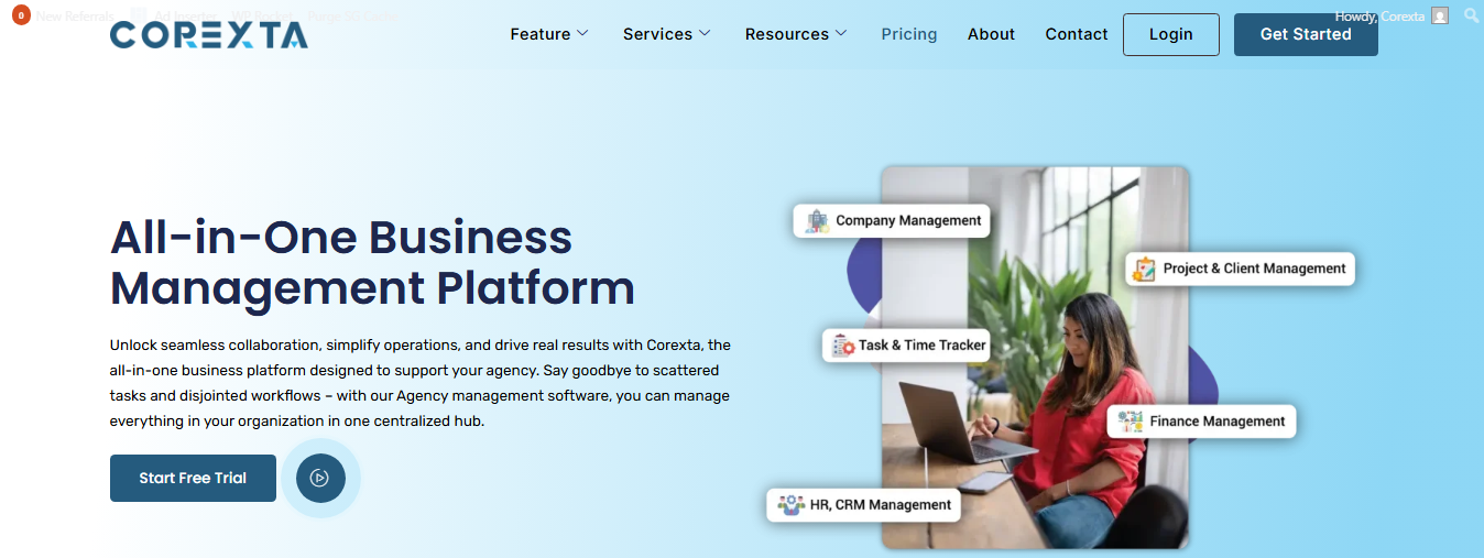
A landing page is a standalone web page created with one clear purpose — to drive a specific action from a visitor. It is where someone ends up after clicking a link from a marketing channel such as an email, online ad, social post, search result, or promotion. The main aim of a landing page is to turn that visitor into a lead or a customer by encouraging them to complete a single action, such as signing up for a newsletter, downloading a guide, registering for a webinar, or making a purchase.
Unlike a homepage, which introduces your brand, offers multiple navigation options, and serves many goals at once, a landing page focuses deeply on one specific message and one clear action. It typically shows no or minimal navigation links, presents an attractive offer, and guides the user toward a strong call-to-action (CTA) button or form. This simple and focused structure improves the chances that visitors will take the desired action, rather than getting distracted or leaving the page too soon.
Landing pages are widely used in paid campaigns, email marketing, product launches, lead generation efforts, and promotional offers because they can be designed to match exactly what was promised to the visitor in the ad or link they clicked. When done right, landing pages significantly improve conversion rates and help businesses measure the success of their marketing efforts more accurately.
10 Landing Page Mistakes That Kill Conversions (and How To Fix Them)
Below is a detailed breakdown of the 10 most common landing page mistakes that stop visitors from converting. Each section explains why the issue hurts performance and how you can fix it — with proven optimization tips from current industry standards and best practices.
1. Ignoring Mobile Responsiveness
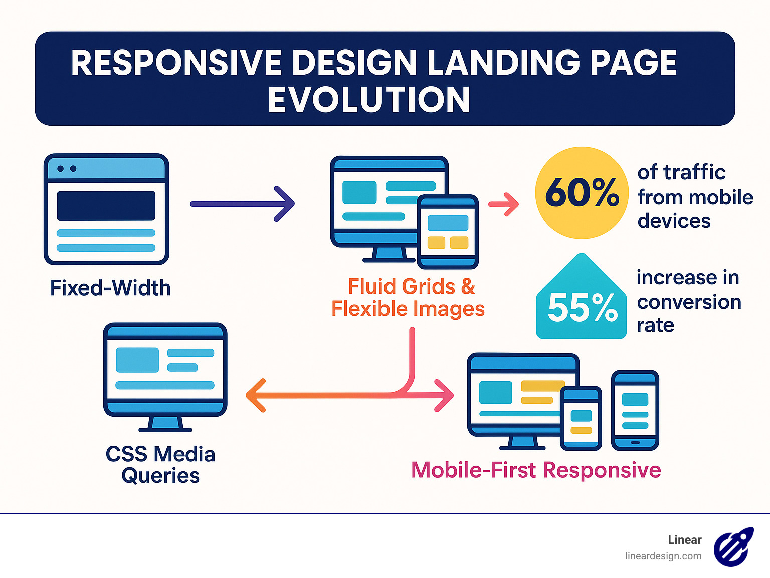
A huge share of web traffic now comes from mobile devices — phones and tablets. Many landing pages fail simply because they aren’t built for smaller screens. If visitors have to zoom, scroll sideways, or struggle to tap buttons, they’ll leave quickly.
Why It Hurts Conversions
-
Text that’s too small on phones makes content unreadable.
-
CTAs and buttons that aren’t touch-friendly frustrate users.
-
Layouts that look good on desktop can break on mobile.
How to Fix It
✅ Adopt a Mobile-First Design: Start with mobile layout and scale up for larger screens.
✅ Test on Real Devices: Emulators are helpful, but real phones show real problems.
✅ Use Responsive Elements: Flexible grids, scalable images, and mobile-friendly form fields keep pages usable everywhere.
✅ Adjust Button Sizes & Placement: Make CTAs easy to tap and hard to miss.
Mobile optimization improves user experience, reduces bounce rate, and can lift conversions significantly.
2. Weak or Confusing Calls to Action (CTAs)

Your CTA — the action you want visitors to take — is the most important part of your landing page. A weak or unclear CTA is one of the biggest reasons visitors bounce without doing anything.
Why It Hurts Conversions
-
Vague buttons like “Submit” or “Click Here” don’t tell users what happens next.
-
CTAs buried below the fold may never be seen.
-
Multiple CTAs create confusion about the primary action.
How to Fix It
✅ Use Action-Oriented Copy: Focus on the result — “Get My Free Guide”, “Start My Trial Today”.
✅ Make CTAs Visible & Contrasting: Use bold colors that stand out from the page.
✅ Limit to One Main CTA: Secondary actions can be distractions unless clearly secondary.
Landing pages with strong, clear CTAs guide visitors and increase the likelihood of conversion.
3. Cluttered or Overwhelming Design
Too much information, too many visuals, and too many elements on a landing page can overwhelm visitors. A chaotic layout makes it hard to understand the offer or the next step.
Why It Hurts Conversions
-
Visitors don’t know where to look first.
-
Competing elements pull attention away from the CTA.
-
Clutter increases cognitive load, leading to bounce.
How to Fix It
✅ Use White Space for Focus: Whitespace helps key elements stand out.
✅ Create Clear Visual Hierarchy: Headline, subheadline, value points, then CTA.
✅ Limit Navigation & Links: Keep users focused on the conversion goal.
A clean, focused design guides the eye toward action and boosts engagement.
4. Slow Page Load Times
Slow pages lose visitors fast — especially on mobile connections. Even a one-second delay can significantly increase bounce rates.
Why It Hurts Conversions
-
Users expect pages to load instantly.
-
Slow load times make your offer feel unreliable.
-
Search engines may rank slower pages lower.
How to Fix It
✅ Optimize Images: Compress without losing quality.
✅ Minimize Scripts: Reduce plugins and third-party scripts.
✅ Use Caching and CDN: Deliver static content faster to users worldwide.
Aim for load times under 3 seconds to keep visitors engaged.
5. Irrelevant or Weak Headlines
Headlines are the first thing visitors see — and they have only a few seconds to decide whether to stay. Unclear or generic headlines fail to grab attention.
Why It Hurts Conversions
-
Visitors can’t quickly tell what you’re offering.
-
Generic value statements don’t connect emotionally.
How to Fix It
✅ Highlight Benefits: Explain the outcome, not features.
✅ Keep It Clear & Specific: Use language your audience understands.
Strong headlines communicate value instantly and entice further reading.
6. Too Much Information
Landing pages should be concise. Too much text can overwhelm or bore visitors, especially on mobile screens.
Why It Hurts Conversions
-
Walls of text are hard to read on scanners.
-
Visitors may lose interest before seeing the CTA.
How to Fix It
✅ Use Short Sections: Break text into small chunks.
✅ Highlight Key Points: Use bullets and bolded lines.
✅ Focus on What Matters Most: Keep only the essentials to support your CTA.
Simple, targeted copy keeps readers moving toward conversion.
7. Poorly Optimized Forms
Forms are often the final step before conversion, but long or confusing forms scare people off.
Why It Hurts Conversions
-
Too many fields increase friction.
-
Users hesitate to share personal details.
How to Fix It
✅ Ask Only What’s Necessary: Save extra details for later steps.
✅ Use Clear Labels & Progress Indicators: Show progress if multi-step.
Short, easy forms reduce abandonment and increase submitted leads.
8. Lack of Trust Signals
New visitors often hesitate to convert if they don’t trust the offer or brand.
Why It Hurts Conversions
-
Lack of proof makes the offer feel risky.
-
No badges or testimonials means less reassurance.
How to Fix It
✅ Add Testimonials & Reviews: Show real customer experiences.
✅ Display Trust Badges: Certifications, security seals, or privacy notices.
Trust signals reduce anxiety and boost credibility — especially for first-time visitors.
9. Broken Links
Links that don’t work frustrate users and make your site look unreliable. They can also interrupt flows like form submissions or CTA actions.
Why It Hurts Conversions
-
Visitors may exit when encountering errors.
-
Broken paths can prevent conversions entirely.
How to Fix It
✅ Regularly Test All Links: Routinely check every link on your landing pages.
✅ Use Redirects for Removed Pages: Avoid dead ends when content moves.
Keeping your pages error-free preserves user trust and conversion continuity.
10. Not Testing and Optimizing Your Landing Page
If you never test, you’ll never know what works best for your audience. Testing and optimization are essential for long-term conversion success.
Why It Hurts Conversions
-
You could be losing conversions without knowing why.
-
Assumptions rarely match real user behavior.
How to Fix It
✅ Run A/B Tests: Compare different headlines, CTAs, or layouts.
✅ Use Analytics: Track user behavior, heatmaps, and conversion paths.
Optimization is not one-time — it’s a continuous cycle that improves performance over time.
Building Winning Landing Pages Doesn’t Have To Be Complicated
Creating landing pages that convert doesn’t have to be difficult. The key is a clear strategy, thoughtful design, and smart execution. Effective landing pages combine simple layouts, strong headlines, persuasive messaging, and best practices in conversion optimization. Regular testing and updates help keep pages performing at their best.
Visitors expect smooth, valuable experiences. Avoid mistakes that drive them away. With expert guidance, you can design landing pages that capture attention, build trust, and drive action. Talk to the experts at Pro Real Tech today to get started. We can help with everything from landing page optimization to SEO and conversion rate improvements. With the right approach, your landing pages can become high-performing tools that turn visitors into customers and deliver measurable results.
Frequently Asked Questions (FAQs) About Landing Page Optimization
WHAT IS A LANDING PAGE AND HOW IS IT DIFFERENT FROM A HOMEPAGE?
A landing page is a standalone web page built for one specific goal. That goal could be collecting leads, selling a product, booking a consultation, or encouraging sign-ups. Visitors usually arrive on a landing page after clicking an ad, email link, or social media promotion.
A homepage is different. It introduces your brand and offers multiple paths for visitors to explore. It includes navigation menus, links to other pages, blog posts, service pages, and more.
A landing page removes distractions. It limits navigation and focuses on one clear call to action. This focus increases the chances that visitors will complete the desired action instead of browsing away.
WHY IS MY LANDING PAGE GETTING TRAFFIC BUT NOT CONVERSIONS?
Traffic without conversions usually points to one or more issues:
-
The message does not match the ad or keyword.
-
The offer is unclear or weak.
-
The CTA is hard to find.
-
The page loads too slowly.
-
The form is too long.
-
There are trust concerns.
Visitors may be interested enough to click, but something on the page creates doubt or friction. Analyze bounce rate, scroll depth, and user behavior. Look for drop-off points. Small improvements in clarity, speed, and trust signals often make a big difference.
WHAT IS THE BIGGEST LANDING PAGE MISTAKE THAT HURTS CONVERSIONS?
The biggest mistake is lack of focus.
When a landing page tries to do too many things, conversions drop. Multiple CTAs, excessive navigation, cluttered design, and unclear messaging confuse visitors.
A high-converting landing page has:
-
One clear audience
-
One strong offer
-
One primary call to action
-
One goal
Clarity converts. Confusion kills conversions.
HOW MANY CTAS SHOULD A LANDING PAGE HAVE?
A landing page should have one primary CTA.
You can repeat that same CTA multiple times throughout the page. For example, at the top, middle, and bottom. However, they should all lead to the same action.
Avoid competing CTAs such as:
-
“Download Now”
-
“Contact Us”
-
“Learn More”
-
“Shop Products”
Multiple actions create hesitation. A focused page keeps decision-making simple.
WHAT SHOULD I INCLUDE ON A HIGH-CONVERTING LANDING PAGE?
A strong landing page typically includes:
-
A clear, benefit-driven headline
-
A supporting subheadline
-
Relevant images or visuals
-
Key benefits or value points
-
Social proof (testimonials, reviews, logos)
-
A strong call to action
-
A short and optimized form
-
Trust signals (security badges, guarantees)
Every element should support the main goal. Remove anything that does not directly contribute to conversions.
HOW DO I KNOW IF MY LANDING PAGE IS MOBILE FRIENDLY?
You can test mobile friendliness in several ways:
-
View the page on multiple real devices.
-
Check if text is readable without zooming.
-
Ensure buttons are easy to tap.
-
Confirm forms are easy to fill out.
-
Make sure there is no horizontal scrolling.
Mobile users should have the same smooth experience as desktop users. If navigation, layout, or speed suffers on smaller screens, conversions will drop.
HOW FAST SHOULD A LANDING PAGE LOAD TO CONVERT WELL?
Ideally, your landing page should load in under three seconds.
Faster is even better. Pages that load in one to two seconds often see stronger engagement and lower bounce rates.
Slow pages hurt paid advertising performance and reduce trust. Compress images, remove heavy scripts, and use caching to improve speed.
Speed is not just a technical factor. It directly impacts revenue.
HOW MANY FORM FIELDS SHOULD A LANDING PAGE HAVE?
The fewer fields, the better.
Most high-performing lead generation pages ask for three to five fields at most. For example:
-
Name
-
Email
-
Phone number
Every additional field increases friction. If you need more information, consider using multi-step forms. Start simple and collect more details later in the sales process.
Always balance lead quality with user convenience.
WHY DO TRUST SIGNALS MATTER ON A LANDING PAGE?
Visitors hesitate when they feel risk.
Trust signals reduce that risk and build confidence. These include:
-
Customer testimonials
-
Case studies
-
Star ratings
-
Client logos
-
Security badges
-
Money-back guarantees
-
Clear contact information
When people see proof that others have had a positive experience, they feel more comfortable converting.
Trust often makes the difference between hesitation and action.
HOW OFTEN SHOULD I TEST AND UPDATE MY LANDING PAGE?
Optimization should be ongoing.
Test elements such as:
-
Headlines
-
CTA wording
-
Button colors
-
Images
-
Layout structure
Even small changes can produce noticeable improvements. Review performance monthly at minimum. High-traffic campaigns may require more frequent testing.
Landing pages should evolve based on real data, not assumptions.
SHOULD I HIRE A PROFESSIONAL TO BUILD OR OPTIMIZE MY LANDING PAGE?
It depends on your goals and budget.
If you lack design, copywriting, or technical expertise, a professional can help avoid costly mistakes. Skilled professionals understand user behavior, conversion psychology, and optimization techniques.
For businesses running paid ads or high-volume campaigns, professional optimization often pays for itself through improved conversion rates.
However, small businesses can start with well-tested templates and improve gradually through testing.
CAN THRIVE HELP IMPROVE MY LANDING PAGE CONVERSION RATE?
Professional digital marketing agencies like Pro Real Tech specialize in conversion optimization, landing page design, and performance analysis.
Agencies typically offer:
-
Conversion rate optimization (CRO) audits
-
A/B testing strategies
-
Copy and design improvements
-
Technical performance optimization
-
Data-driven marketing insights
If your landing page is not converting despite strong traffic, working with experienced professionals can help identify hidden weaknesses and implement proven improvements.


