
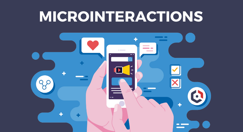
In today’s digital landscape, user experience (UX) can make or break a product. While major design elements like layouts and navigation menus grab attention, it’s often the subtle, almost invisible details—microinteractions—that leave a lasting impression.
Microinteractions are small, functional animations or feedback loops that respond to user actions, such as a “like” button animating when clicked or a progress bar filling as a file uploads. These tiny moments may seem insignificant, but they play a pivotal role in enhancing usability, guiding behavior, and even evoking emotions.
From boosting engagement to reinforcing brand identity, well-designed microinteractions bridge the gap between users and interfaces. In this blog, we’ll explore their importance, best practices, and how to implement them effectively—without compromising performance or accessibility.
What Are Microinteractions?
Microinteractions are small, subtle design elements that serve a single purpose: to improve user experience by providing feedback, guiding actions, or adding moments of delight. These tiny interactions often go unnoticed when done well but significantly impact how users perceive and interact with a digital product.
Key Characteristics of Microinteractions:
-
Trigger – A user action (click, swipe, hover) or system event (notification, loading) that initiates the interaction.
-
Feedback – An immediate visual, auditory, or haptic response confirming the action (e.g., a button color change, vibration, or sound).
-
Rules – The logic determining how the interaction behaves (e.g., animation speed, transition style).
-
Loops & Modes – Whether the interaction repeats (like a loading spinner) or changes state (such as a toggle switch).
Examples:
-
A “like” button that animates when clicked (e.g., Facebook’s heart reaction).
-
A pull-to-refresh animation in mobile apps.
-
A progress bar showing file upload status.
-
A subtle “ding” sound when a message is sent.
By focusing on these small but meaningful details, designers can create more intuitive, engaging, and human-friendly interfaces.
The Importance of Microinteractions in Optimizing Modern UX Design
Microinteractions may be small in scale, but their impact on user experience is substantial. When thoughtfully designed, they enhance usability, create emotional connections, and make digital interactions feel more intuitive and human. Here’s why they’re essential in modern UX design:
1. Provide Feedback
Microinteractions act as instant communication tools, confirming user actions and reducing uncertainty. For example:
-
A button changing color when clicked reassures users that their input was registered.
-
A loading spinner indicates that a process is underway, preventing frustration.
Without these subtle cues, users might question whether their actions were successful, leading to repeated clicks or confusion.
2. Enhance Usability
Well-designed microinteractions guide users seamlessly through tasks by:
-
Highlighting interactive elements (e.g., a subtle hover effect on buttons).
-
Preventing errors (e.g., a form field shaking if input is invalid).
-
Simplifying complex processes (e.g., step-by-step animations in onboarding flows).
These small details make interfaces more intuitive, reducing cognitive load and improving task completion rates.
3. Add Delight
Beyond functionality, microinteractions can evoke positive emotions, turning mundane tasks into enjoyable experiences. Examples include:
-
Playful animations (e.g., Slack’s “message sent” confetti).
-
Whimsical sounds (e.g., Duolingo’s celebratory chimes for correct answers).
These moments of surprise and delight foster emotional connections, making users more likely to return.
4. Encourage User Engagement
Microinteractions can nudge users toward desired behaviors by making interactions satisfying. For instance:
-
A “streak counter” in fitness apps motivates daily use.
-
Interactive hover effects on e-commerce products encourage exploration.
By rewarding engagement, these small design elements drive longer session times and higher retention.
5. Strengthen Brand Identity
Consistent microinteractions reinforce brand personality. For example:
-
Mailchimp’s high-five animation reflects its friendly tone.
-
Apple’s smooth toggle switches align with its sleek, minimalist aesthetic.
When every microinteraction aligns with brand values, the overall experience feels cohesive and memorable.
Microinteractions are the unsung heroes of UX design—tiny in size but mighty in impact. By providing feedback, enhancing usability, adding delight, boosting engagement, and reinforcing brand identity, they transform functional interfaces into exceptional experiences.
4 Best Practices for Designing Effective Microinteractions
While microinteractions can significantly enhance UX, their effectiveness depends on thoughtful execution. Follow these best practices to ensure your microinteractions are purposeful, intuitive, and engaging:
1. Keep It Simple
Microinteractions should feel effortless—never distracting or overwhelming.
-
Focus on one task (e.g., a button press, swipe gesture).
-
Use subtle animations (e.g., a brief color fade instead of a flashy bounce).
-
Avoid unnecessary complexity that could slow performance or confuse users.
Example: Google’s material design uses minimal motion to indicate button clicks, maintaining clarity without excess flair.
2. Ensure Consistency
Uniformity in microinteractions creates a cohesive experience.
-
Match brand aesthetics (e.g., playful vs. professional tones).
-
Reuse patterns (e.g., all buttons should animate the same way).
-
Align with platform conventions (e.g., iOS’s “swipe to delete” vs. Android’s patterns).
Example: Twitter’s “like” animation (a heart burst) is consistent across all platforms, reinforcing recognition.
3. Prioritize Functionality
Microinteractions must serve a purpose—never sacrifice usability for style.
-
Solve a problem (e.g., a progress bar reduces uncertainty during waits).
-
Optimize performance (avoid heavy animations that lag on low-end devices).
-
Ensure accessibility (provide audio/haptic feedback for visually impaired users).
Example: LinkedIn’s “reaction” buttons use quick, lightweight animations to avoid delaying user interactions.
4. Test for User Experience
Validate microinteractions with real users to refine their impact.
-
A/B test variations (e.g., different animation speeds or sounds).
-
Monitor metrics (e.g., engagement rates, error reduction).
-
Gather feedback to identify annoyances or unnoticed interactions.
Example: Airbnb continuously tests microinteractions (like its saved-item “heart” animation) to balance delight and usability.
Effective microinteractions are simple, consistent, functional, and user-validated. By adhering to these principles, you can elevate UX without compromising performance or clarity.
Common Mistakes to Avoid
While microinteractions can enhance UX, poor implementation can backfire. Here are key pitfalls to watch out for:
1. Overcomplicating Animations
-
Problem: Excessive or flashy animations slow down interactions and distract users.
-
Solution: Keep animations under 300ms for quick feedback. Use easing curves for natural motion.
-
Example: Avoid elaborate loading animations that make users wait longer than necessary.
2. Disregarding Accessibility
-
Problem: Microinteractions that rely solely on visuals exclude users with disabilities.
-
Solution:
-
Add haptic feedback or sound cues for key interactions
-
Ensure sufficient color contrast for visual feedback
-
Provide alternative text for animated elements
-
-
Example: A color change alone shouldn’t indicate success – add an icon or text confirmation.
3. Overloading the Interface
-
Problem: Too many microinteractions create visual noise and confuse users.
-
Solution:
-
Reserve animations for primary actions only
-
Maintain negative space around interactive elements
-
Establish hierarchy – not every element needs feedback
-
-
Example: A form where every field animates on hover can feel chaotic rather than helpful.
Effective microinteractions should feel invisible – users notice them only when they’re missing. By avoiding these common mistakes, you ensure your microinteractions enhance rather than hinder the user experience.
Remember: The best microinteractions solve problems rather than create them. Always prioritize clarity and purpose over decorative flair.
3 Tips on How to Implement Microinteractions in Your Design

Microinteractions can elevate your UX when implemented strategically. Follow these actionable tips to integrate them effectively into your designs:
1. Identify Key Interactions
Focus on high-impact moments where microinteractions will add the most value:
-
Critical user actions (e.g., form submissions, purchases)
-
Moments of uncertainty (e.g., loading states, transitions)
-
Opportunities for engagement (e.g., social reactions, achievements)
How to implement:
-
Audit user flows to pinpoint friction points
-
Prioritize interactions that provide clear feedback or guidance
-
Example: An e-commerce site might focus on cart additions and checkout progress
2. Design Thoughtfully
Create purposeful microinteractions that align with user needs and brand identity:
-
Keep animations fast (200-500ms) and natural
-
Use appropriate easing curves for different actions
-
Maintain visual hierarchy – don’t let animations steal focus
Best practices:
-
Match motion style to your brand personality
-
Ensure interactions work across devices and input methods
-
Example: A productivity app might use subtle, efficient animations while a game could be more playful
3. Test and Iterate
Validate your microinteractions with real users:
-
Conduct usability testing to identify confusing or annoying elements
-
A/B test different animation styles and durations
-
Monitor performance metrics (engagement, completion rates)
Optimization tips:
-
Start with basic functionality, then enhance
-
Be prepared to simplify or remove interactions that don’t work
-
Example: A social app might test whether animated reactions increase engagement
Successful microinteraction implementation requires strategic selection, thoughtful design, and continuous refinement. By focusing on meaningful interactions and testing with real users, you can create subtle yet powerful enhancements to your UX.
Let Pro Real Tech Marketing Agency Craft Your Standout Online Presence
Microinteractions might seem minor, but they make a major difference in user experience. A strategically designed website enhances usability while reinforcing your brand identity—creating an intuitive, enjoyable journey that encourages engagement.
At Pro Real Tech, we know that exceptional web design goes beyond looks. Thoughtful microinteractions reduce friction, boost engagement, and keep users returning. The right UX details don’t just satisfy—they convert.
Elevate your digital experience with Pro Real Tech. Our UX specialists design seamless microinteractions that align with your brand and delight your audience.


