
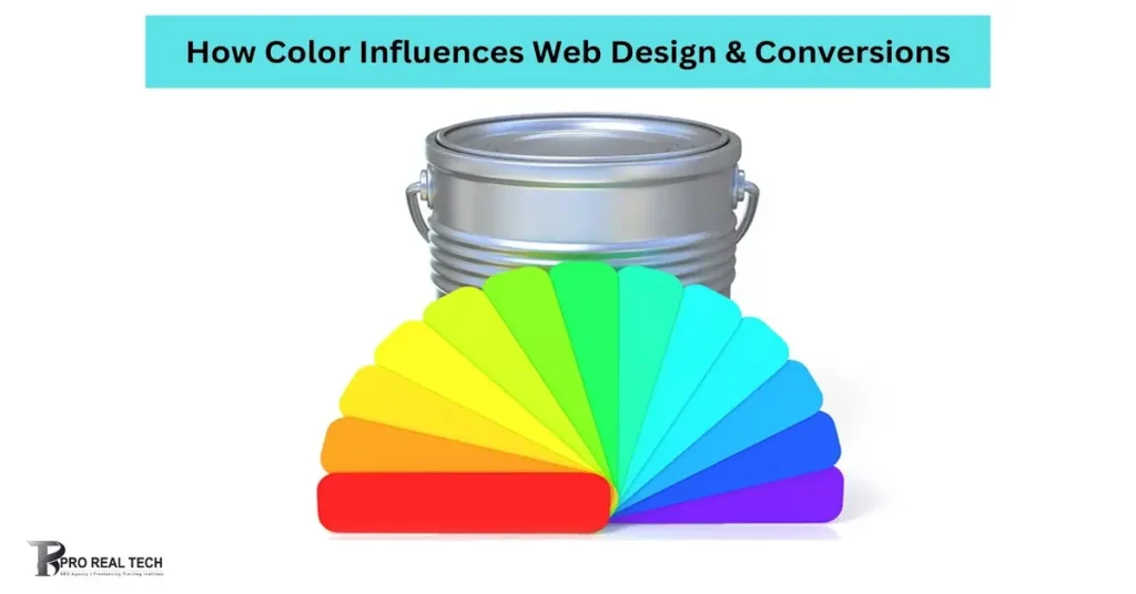
Color plays a huge role in web design. It can grab attention, set the mood, and guide users through a website. Colors can even influence how people feel and act. This is known as color psychology. When used correctly, colors can boost website conversions. This means more people will buy products, sign up for newsletters, or take other desired actions.
Each color has its own effects. For example, red can create excitement, while blue can make people feel calm. Choosing the right colors for your site can help make your brand more memorable. It can also make your website easier to navigate.
Web designers use colors to create a visual hierarchy. This helps users know what to look at first and what is most important. Colors can highlight buttons, links, and other key elements. This can guide users to take specific actions, like making a purchase or filling out a form.
In this blog, we will explore how different colors affect web design. We will look at the benefits of using color and give tips on when and how to use different colors on your site. Understanding color psychology can help you make better design choices. This can lead to higher conversions and a more successful website.
What Is Color Psychology?
Color psychology is the study of how colors affect our thoughts and feelings. Different colors can make us feel happy, sad, excited, or calm. This is because our brains react to colors in certain ways. When we see a color, it can trigger an emotional response.
In web design, color psychology helps us understand how to use colors to influence visitors. For example, blue is often seen as a calm and trustworthy color. This is why many banks and health websites use blue. Red is a color that grabs attention. It can create a sense of urgency, which is why it is often used in sales and clearance signs.
Colors can also have different meanings in different cultures. For instance, white is often associated with purity and cleanliness in many Western cultures. In some Eastern cultures, however, white can be associated with mourning. This is important to keep in mind when designing websites for a global audience.
Using color psychology in web design involves choosing colors that match the message you want to send. If you want your website to feel lively and energetic, you might use bright colors like yellow or orange. If you want it to feel calm and professional, you might choose cooler colors like blue or green.
Colors can be used to create a visual hierarchy on your website. This means using different colors to show what is most important. For example, you can use a bold color for your call-to-action buttons to make them stand out. This guides users to take the actions you want them to take.
How Website Color Psychology Works
The study of web-based color psychology analyzes how colors affect users’ feelings, actions, and perceptions when they are on a website. People react differently to different colors, which affects how they perceive and engage with your business or content. One can closely use colors. The user experience can be customized by using the appropriate colors, which will influence the user’s behavior based on associations.
Benefits Of Using Color In Website Design
Using color in website design offers many benefits. It can help increase brand recognition, draw attention, and impact users’ emotions. Each of these benefits can lead to better user engagement and higher conversions.
Increase Brand Recognition
Color plays a crucial role in building a brand. A consistent color scheme can make a brand more recognizable. When people see the same colors used in a logo, website, and marketing materials, they start to associate those colors with the brand. This creates a strong visual identity. For example, when you see red and yellow, you might think of McDonald’s. Consistent use of color can make your brand stand out and be memorable.
Helps Draw Attention
Colors can help guide users’ eyes to important parts of a website. Bright and contrasting colors can highlight call-to-action buttons, links, and other key elements. This helps users find what they need quickly. For example, a red button on a white background will stand out more than a grey button. Using color to draw attention can improve the overall user experience. It makes it easier for visitors to navigate the site and take desired actions, like making a purchase or signing up for a newsletter.
Impacts Users’ Emotions
Colors have the power to affect how people feel. This is known as emotional impact. Different colors can evoke different emotions. For instance, blue can make people feel calm and secure, while yellow can make them feel happy and energetic. By choosing the right colors, you can set the mood of your website. This can influence how visitors feel when they browse your site. A site that feels welcoming and positive can keep visitors engaged longer. This increases the chances they will take action, such as buying a product or filling out a form.
Colors You Can Use on Your Site
Let’s take a look at the different colors you can use on your web design.
White
White is a very popular color in web design. It is clean, simple, and modern. White can make a website look open and uncluttered. It helps other colors stand out and can make text easy to read.
When to Use White on Your Site
Use white when you want a fresh and minimalist look. It is great for backgrounds because it makes other elements pop. White space, or negative space, helps to create a balanced layout. This can improve the user experience by making the site easier to navigate. White is also ideal for sites that want to convey purity, simplicity, or cleanliness, like health and wellness sites.
When to Avoid White on Your Site
Avoid using too much white if your site needs to feel warm and inviting. Large areas of white can sometimes feel cold or sterile. This might not be suitable for sites that aim to be cozy or personal, like blogs or community pages. Additionally, white can cause eye strain in low-light environments, so consider your audience’s viewing conditions.
Black
Black is a strong and powerful color. It can make a website look elegant and sophisticated. Black is often used for text because it provides high contrast and is easy to read against light backgrounds.
When to Use Black on Your Site
Use black when you want to create a sense of luxury or professionalism. It is perfect for high-end products, fashion sites, or portfolios. Black can also be used to highlight important elements when combined with other colors. It makes bright colors stand out more and can create a dramatic effect. Black backgrounds can give a site a modern and sleek look.
When to Avoid Black on Your Site
Avoid using too much black if you want a light and airy feel. Black can make a website look heavy or dark if overused. This might not be suitable for sites that aim to be cheerful or friendly. Black can also make text hard to read if used as a background color, especially with dark-colored text. Always consider readability and balance when using black.
Red
Red is a bold and powerful color. It can grab attention quickly and evoke strong emotions. Red is often associated with excitement, passion, and urgency. Because of its intensity, red can make a big impact in web design.
When to Use Red on Your Site
Use red when you want to create a sense of urgency or excitement. It is great for call-to-action buttons, sales banners, and important announcements. Red can also highlight critical information, like warnings or errors. Websites focused on sports, entertainment, or food often use red to convey energy and passion. In small doses, red can draw attention to key areas without overwhelming the user.
When to Avoid Red on Your Site
Avoid using too much red as it can be overwhelming and even stressful. Large areas of red can be harsh on the eyes and may cause discomfort. This color may not be suitable for sites that aim to be calming or professional, like health or finance websites. Additionally, red can symbolize danger or negativity in some contexts, so use it carefully to avoid sending the wrong message.
Blue
Blue is a versatile and calming color. It is often associated with trust, reliability, and professionalism. Blue is one of the most popular colors used in web design because of its wide appeal and soothing effect.
When to Use Blue on Your Site
Use blue when you want to create a sense of calm and trust. It is ideal for websites related to finance, healthcare, and technology. Blue can make visitors feel safe and secure, which is why many banks and insurance companies use it. Lighter shades of blue can give a fresh and clean look, while darker shades can add a touch of elegance and professionalism. Blue is also effective for backgrounds and larger sections because it is easy on the eyes.
When to Avoid Blue on Your Site
Avoid using blue if you want to convey warmth or excitement. Blue is a cool color and can sometimes feel distant or uninviting. It might not be the best choice for websites that aim to be lively or energetic, like children’s websites or entertainment pages. Also, be cautious with darker shades of blue, as they can appear too formal or somber if overused.
Yellow
Yellow is a bright and cheerful color. It often brings feelings of happiness, energy, and optimism. Yellow can catch the eye quickly and is a great way to draw attention to certain parts of your website.
When to Use Yellow on Your Site
Use yellow when you want to create a sense of warmth and friendliness. It is perfect for adding a pop of color to your design. Yellow works well for call-to-action buttons, banners, and highlights. It is also great for children’s websites, food sites, and any site that wants to convey joy and enthusiasm. Yellow can make users feel welcome and happy, making their experience on your site more pleasant.
When to Avoid Yellow on Your Site
Avoid using too much yellow as it can be overwhelming and hard on the eyes. Large areas of bright yellow can cause visual fatigue. Yellow can also be hard to read when used for text, especially on a white background. For more serious and professional websites, such as those for financial services or law firms, yellow might not convey the right tone. It can come off as too casual or playful for these contexts.
Green
Green is a versatile and calming color. It is often associated with nature, growth, and health. Green can create a sense of balance and tranquility, making it a popular choice in web design.
When to Use Green on Your Site
Use green when you want to promote a sense of harmony and peace. It is an excellent choice for environmental websites, health and wellness sites, and businesses related to agriculture or gardening. Green is also effective for financial websites because it is associated with wealth and stability. Light green shades can make a site feel fresh and clean, while darker greens can add a touch of elegance and professionalism. Green is also good for backgrounds and accents, providing a calm and pleasing visual experience.
When to Avoid Green on Your Site
Avoid using green if it conflicts with other colors on your site. Some shades of green may not pair well with certain colors, making the overall design look uncoordinated. Green can also feel too relaxed or passive for sites that need to convey urgency or excitement, like news sites or entertainment platforms. Additionally, be mindful of cultural differences, as green can have different meanings in various cultures.
Orange
Orange is a vibrant and energetic color. It combines the warmth of red and the cheerfulness of yellow. Orange can make your website feel lively and inviting.
When to Use Orange on Your Site
Use orange when you want to create a sense of enthusiasm and excitement. It is great for call-to-action buttons, promotional banners, and highlights. Orange is perfect for websites related to sports, entertainment, and food. It can draw attention without being as intense as red. Orange can also evoke feelings of warmth and friendliness, making users feel welcome.
When to Avoid Orange on Your Site
Avoid using too much orange as it can be overwhelming. Large areas of orange can be tiring on the eyes. Orange might not be suitable for professional or serious websites, such as legal services or corporate sites. It can come across as too playful for these contexts. Additionally, be mindful of cultural associations, as orange can have different meanings in different cultures.
Pink
Pink is a soft and nurturing color. It is often associated with love, compassion, and calm. Pink can add a gentle and feminine touch to your website.
When to Use Pink on Your Site
Use pink when you want to create a warm and inviting atmosphere. It is ideal for websites focused on beauty, fashion, and children. Pink works well for call-to-action buttons, backgrounds, and accents. Lighter shades of pink can give a fresh and delicate feel, while darker shades can add sophistication. Pink can make users feel relaxed and cared for.
When to Avoid Pink on Your Site
Avoid using too much pink if you want to appeal to a broad audience. Pink can sometimes be seen as too feminine and may not suit all types of websites. It might not be the best choice for professional or technical sites, such as finance or IT services. Additionally, using too much pink can make a site look overly sweet or childish, which may not convey the desired tone.
Purple
Purple is a color that combines the stability of blue and the energy of red. It is often associated with royalty, luxury, and creativity. Purple can give your website a sophisticated and unique look.
When to Use Purple on Your Site
Use purple when you want to create a sense of elegance and creativity. It is ideal for luxury brands, beauty products, and artistic ventures. Purple can make your site feel premium and exclusive. Lighter shades of purple, like lavender, can add a calming and soothing effect, making them great for wellness or spa websites. Darker shades, like plum or royal purple, can add depth and richness, making them perfect for high-end products and services.
When to Avoid Purple on Your Site
Avoid using too much purple as it can be overwhelming and may dominate other elements. Purple might not be suitable for websites that need to convey straightforwardness and simplicity, like business consulting or financial services. It can sometimes appear too extravagant or dramatic for these contexts. Also, be cautious with darker shades, as they can make a site feel heavy if not balanced with lighter elements.
Brown
Brown is a warm and grounded color. It is often associated with earthiness, reliability, and stability. Brown can give your website a natural and comfortable feel.
When to Use Brown on Your Site
Use brown when you want to create a sense of warmth and trust. It is ideal for websites related to nature, food, and crafts. Brown can make users feel cozy and grounded, which is perfect for brands that want to convey reliability and simplicity. Light browns and tans can add a soft and approachable feel, while darker browns can add richness and depth, making them suitable for products related to coffee, chocolate, or woodwork.
When to Avoid Brown on Your Site
Avoid using too much brown if you want a modern and sleek look. Brown can sometimes feel outdated or dull if overused. It might not be the best choice for tech or fashion websites that aim for a trendy and cutting-edge image. Additionally, brown can be tricky to pair with some colors, so ensure your color scheme is well-balanced to avoid a heavy or monotonous appearance.
Additional Components to Go with Your Website’s Color Scheme
While color choice is essential in web design, it is just one aspect of creating a visually appealing and effective website. Other elements such as typography, imagery, layout, navigation, and animations also play a crucial role in complementing the chosen colors and enhancing the overall design aesthetic.
Typography:
Typography refers to the style and arrangement of text on a website. It includes font choice, font size, spacing, and alignment. The typography should complement the chosen colors and enhance the overall design aesthetic. For example, pairing a bold sans-serif font with vibrant colors can create a modern and energetic feel, while using a classic serif font with muted colors can evoke a more traditional and sophisticated atmosphere.
Imagery:
Images and graphics play a crucial role in web design. They help to convey messages, evoke emotions, and enhance the visual appeal of a website. The choice of imagery should align with the color palette to create a cohesive look and feel. For instance, using photos with similar color tones as the website’s primary colors can create a harmonious and unified design. Additionally, incorporating images that match the mood and style of the colors can reinforce the overall message of the website.
Layout:
The layout of a website refers to the arrangement of its elements, including text, images, and interactive features. A well-designed layout should guide users through the content in a logical and intuitive manner. The layout should complement the chosen colors by providing a clear and organized structure. For example, using ample white space around colorful elements can make them stand out and draw attention. Additionally, incorporating grid-based layouts can help maintain visual consistency and balance.
Navigation:
Navigation refers to the menu and navigation elements that allow users to move around a website. A well-designed navigation system should be intuitive, easy to use, and visually appealing. The color choices for navigation elements should be consistent with the overall color scheme of the website. For example, using the same color for links and buttons throughout the site helps users recognize interactive elements and navigate with ease. Additionally, incorporating visual cues such as hover effects or subtle animations can enhance the user experience and make navigation more engaging.
Animations and Interactions:
Animations and interactions can add depth and interactivity to a website. They can capture users’ attention, provide feedback, and create memorable experiences. When incorporating animations and interactions, it’s essential to consider how they complement the chosen colors and enhance the overall design aesthetic. For example, using subtle animations that match the color palette can create a cohesive and polished look. Additionally, incorporating interactive elements that respond to user actions can make the website more engaging and enjoyable to use.
FAQs
How does color influence web design?
Color influences web design by evoking emotions, creating visual hierarchy, and guiding user behavior. Different colors can evoke different emotions and associations, shaping users’ perceptions of a website. Colors also help create a visual hierarchy, guiding users’ attention to important elements such as call-to-action buttons and navigation menus. By understanding color psychology and using it effectively in web design, designers can create websites that are visually appealing, engaging, and effective in achieving their goals.
What are some common mistakes to avoid when choosing colors for web design?
Some common mistakes to avoid when choosing colors for web design include using too many colors, using clashing color combinations, and neglecting accessibility considerations. Using too many colors can overwhelm users and distract from important content. Clashing color combinations can make a website difficult to read and navigate. Neglecting accessibility considerations, such as ensuring sufficient color contrast for users with visual impairments, can result in a website that is inaccessible to some users.
How can I choose the right colors for my website?
To choose the right colors for your website, consider your brand identity, target audience, and the emotions you want to evoke. Start by identifying your brand’s primary colors and any associated meanings or associations. Then, consider your target audience’s preferences and cultural backgrounds. Finally, choose colors that align with the emotions you want to evoke and the goals of your website. You can also use color psychology principles to guide your color choices.
Can I change the colors of my website after it’s been designed?
Yes, you can change the colors of your website after it’s been designed. Most website design platforms and content management systems allow you to easily customize the colors of your website. However, it’s important to consider the potential impact of color changes on your brand identity and user experience. Before making any significant color changes, carefully evaluate how they will affect the overall look and feel of your website and consult with your design team if necessary.
How can I measure the impact of color on conversions?
To measure the impact of color on conversions, you can conduct A/B tests or split tests. A/B tests involve creating two versions of a web page with different color schemes and randomly assigning visitors to each version. By tracking user behavior, such as click-through rates and conversion rates, you can determine which color scheme is more effective in achieving your conversion goals. Additionally, you can analyze website analytics data to identify any correlations between color choices and user actions.


