
Imagine walking into a well-organized store where everything is easy to find—signs are clear, aisles are logically structured, and helpful guides point you in the right direction. Now picture the opposite: a cluttered, confusing space where you can’t locate what you need.
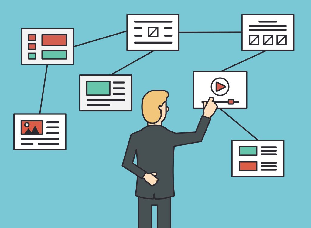
Your website is no different. Website navigation is the roadmap that helps visitors explore your content effortlessly. A well-designed navigation system improves user experience (UX), boosts engagement, and even enhances your site’s SEO performance.
Whether you’re designing a new site or refining an existing one, this guide will walk you through:
- The fundamentals of website navigation
- Different types and structures
- Best practices for intuitive design
- How navigation impacts SEO
- Ways to optimize based on user behavior
What Is Website Navigation?
Website navigation refers to the system of menus, links, and tools that help users move through your website seamlessly. It acts as a digital compass, guiding visitors to the information they need without frustration.
Why Does It Matter?
- User Experience (UX): Poor navigation leads to high bounce rates. Users should find what they want in 3 clicks or fewer.
- SEO Benefits: Search engines like Google prioritize sites with clear, crawlable structures. Logical navigation improves indexing and rankings.
- Conversions: A smooth journey (e.g., from product page to checkout) directly impacts sales, sign-ups, or other goals.
Core Components of Navigation
- Menus (Primary/Secondary): The main pathways (e.g., “Home,” “About,” “Services”).
- Links & CTAs: Internal hyperlinks and buttons that direct users.
- Search Bars: For quick access to specific content.
- Breadcrumbs: Secondary trails showing a user’s location (e.g., Home > Blog > SEO Tips).
5 Types of Website Navigation
A well-structured navigation system ensures users can explore your website effortlessly. Here are the five most common types, each serving a unique purpose:
1. Main Navigation (Primary Menu)
The backbone of your website’s structure, typically displayed as a horizontal bar at the top of the page.
Key Features:
- Contains core sections like Home, About, Services, Blog, Contact.
- Should be simple and concise (5-7 items max to avoid overwhelming users).
- Often includes dropdowns for deeper pages (e.g., “Services → Web Design”).
Best For:
- First-time visitors looking for essential information.
- SEO, as search engines prioritize primary menu links.
2. Secondary Navigation (Sub-Menus, Sidebar Menus)
Supplements the main menu by organizing related subpages or offering alternative pathways.
Examples:
- Dropdown menus under primary items (e.g., “Products → Software → Pricing”).
- Sidebar navigation (common in blogs/dashboards for categories or filters).
- Utility menus (e.g., Login, Cart, Language Selector).
Best For:
- Large websites with complex hierarchies (e.g., e-commerce, educational sites).
- Users who need contextual options without cluttering the main menu.
3. Breadcrumb Navigation
A secondary trail showing the user’s location within the site’s hierarchy.
Example:
Home > Electronics > Smartphones > iPhone 15
Why It Works:
- Reduces clicks to return to previous sections.
- Improves SEO by reinforcing site structure for search engines.
- Enhances UX, especially for content-heavy sites (e.g., blogs, e-commerce).
Best For:
- Multi-level websites where users drill deep into categories.
4. Footer Navigation
Often overlooked but critical for usability, the footer houses links that don’t fit in the main menu.
Common Footer Links:
- Legal pages (Privacy Policy, Terms).
- Contact info, social media icons.
- Sitemap links or repeat key pages (e.g., “Careers”).
Best For:
- Mobile users (easy thumb access at the bottom).
- SEO, as it helps search engines discover deep pages.
5. Search Functionality
A lifeline for users who know exactly what they want.
Key Tips:
- Place the search bar prominently (top-right corner is standard).
- Add filters/autocomplete to speed up results (e.g., e-commerce sites).
- Optimize for long-tail keywords (e.g., “men’s waterproof hiking boots”).
Best For:
- Large sites (10+ pages) with diverse content.
- E-commerce, news portals, or support hubs.
Which Type Should You Use?
Most websites combine 2–4 types (e.g., primary menu + footer + search). The right mix depends on:
- Site size (small sites may skip breadcrumbs).
- User goals (e-commerce needs search; blogs need categories).
How Do You Decide Which Structure Works Best?
Choosing the right navigation structure for your website isn’t about following trends—it’s about aligning with user behavior and business goals. Here’s a step-by-step approach to making the best decision:
1. Define Your Website’s Purpose
Different types of websites require different navigation styles:
- E-commerce: Needs hierarchical menus + search + filters (e.g., Amazon’s mega menus).
- Blogs/News: Benefits from categories, tags, and a search bar (e.g., BBC’s topic-based navigation).
- Portfolios/Service Sites: Keep it simple (e.g., 5-item main menu + contact CTA).
- Corporate Sites: May need multi-level dropdowns for departments, investor info, etc.
Ask yourself:
- What’s the primary action you want users to take? (Buy, read, contact, etc.)
- How much content do you have? (A 5-page site vs. a 500-page knowledge base need different approaches.)
2. Analyze Your Audience’s Behavior
Use data to guide your decisions:
- Heatmaps (Hotjar, Crazy Egg): See where users click most.
- Google Analytics: Check top exit pages or navigation paths.
- User Testing: Watch real people navigate your site—where do they get stuck?
Example:
If users frequently abandon your checkout page, a simplified cart navigation (e.g., a persistent cart icon) might help.
3. Prioritize Usability Over Creativity
While unique designs can stand out, clarity trumps cleverness. Follow these rules:
- Limit main menu items to 5–7 (psychologically easier to process).
- Use familiar labels (e.g., “Contact Us” instead of “Reach Out”).
- Avoid deep dropdowns (3+ levels frustrate users).
Test: If you need jargon (e.g., “Solutions” vs. “Services”), A/B test to see which performs better.
4. Match Navigation to Content Hierarchy
Map out your site’s structure like a flowchart:
- Flat Structure: Fewer levels (best for small sites).
Home → About → Services → Contact
- Deep Structure: Multiple tiers (for large sites).
Home → Products → Electronics → Cameras → DSLR
Tip: Use breadcrumbs if your site has 3+ levels to avoid “lost” users.
5. Optimize for Mobile & SEO
- Mobile First: 60%+ traffic comes from phones—use hamburger menus or sticky footers.
- SEO-Friendly Links: Ensure navigation is crawlable (avoid JavaScript-heavy menus that search engines can’t read).
- Internal Linking: Use navigation to pass SEO “link equity” to key pages.
Example:
An e-commerce site should link to high-priority categories (e.g., “Best Sellers”) in the main menu for SEO.
6. Test and Iterate
Even the best-planned navigation needs refinement. Try:
- A/B Testing: Compare two menu styles (e.g., dropdown vs. mega menu).
- Session Recordings: Watch how real users navigate.
- Feedback Surveys: Ask, “Did you find what you needed?”
The best navigation structure is invisible—users don’t notice it because it just works. Start with your audience’s needs, keep it simple, and let data guide your tweaks.
5 Website Navigation Design Best Practices
Effective navigation is the cornerstone of a successful website. A well-designed navigation system improves user experience (UX), engagement, and conversion rates. Below are five essential best practices to optimize your website navigation.
1. Prioritize Simplicity
Why it matters:
Users should find what they need within 3 clicks or less. Overly complex navigation leads to frustration and higher bounce rates.
How to implement:
✔ Limit main menu items to 5–7 options (cognitive psychology suggests this is the ideal range for quick processing).
✔ Avoid excessive dropdowns—nested menus beyond 2 levels can confuse users.
✔ Use whitespace to reduce visual clutter and improve focus.
✔ Stick to standard layouts (e.g., horizontal top menu, hamburger menu on mobile).
Example:
- ❌ Bad: A main menu with 10+ options, including vague labels like “Solutions.”
- ✅ Good: A clean menu with clear labels: “Home, About, Services, Blog, Contact.”
2. Maintain Consistency
Why it matters:
Consistent navigation ensures users don’t have to relearn how to browse your site on different pages.
How to implement:
✔ Keep the main menu in the same location (usually top of the page).
✔ Use uniform styling (font, colors, hover effects) across all navigation elements.
✔ Ensure mobile & desktop navigation are logically aligned (e.g., if “Shop” is in the main menu on desktop, it shouldn’t be hidden in mobile).
✔ Repeat key links in the footer (e.g., Contact, Privacy Policy).
Example:
- Amazon keeps its search bar and main categories consistent across all pages, making shopping intuitive.
3. Establish Hierarchy and Prioritization
Why it matters:
Not all pages are equally important. A clear visual hierarchy guides users to key actions (e.g., purchases, sign-ups).
How to implement:
✔ Place high-priority items first (left side in LTR languages, like “Shop” or “Pricing”).
✔ Highlight CTAs with contrasting colors (e.g., a bright “Get Started” button).
✔ Group related pages (e.g., “Resources → Blog, Guides, Webinars”).
✔ Use size and spacing to emphasize importance (larger text for primary links).
Example:
- Apple’s website prioritizes “Store” and “Mac” in its main menu, pushing less critical links like “Accessories” to dropdowns.
4. Ensure Clear Labeling
Why it matters:
Users scan menus quickly—vague labels (e.g., “Solutions”) increase cognitive load and reduce engagement.
How to implement:
✔ Use common, descriptive terms (e.g., “Contact Us” instead of “Reach Out”).
✔ Avoid jargon unless your audience understands it (e.g., “B2B SaaS” might confuse general users).
✔ Test labels with real users (A/B test “Pricing” vs. “Plans”).
✔ Keep labels short (1–2 words max).
Example:
- ❌ Unclear: “Explore Our Offerings”
- ✅ Clear: “View Plans”
5. Enhance Scannability
Why it matters:
Users skim before reading. Scannable navigation helps them find content faster.
How to implement:
✔ Use visual cues (icons, dividers, or bold text) to break up sections.
✔ Implement sticky menus that stay visible while scrolling.
✔ Optimize for mobile thumb zones (place key menus within easy reach).
✔ Add a search bar for power users who know what they want.
Example:
- Wikipedia’s sidebar table of contents lets users jump to sections instantly.
Testing & Iteration
Even the best designs need refinement. Regularly:
- A/B test different menu layouts.
- Analyze heatmaps (Hotjar) to see where users click.
- Run usability tests (ask people to complete tasks like “Find the pricing page”).
Great navigation feels invisible—users don’t notice it because it just works. By focusing on simplicity, consistency, hierarchy, clear labels, and scannability, you’ll create a seamless experience that keeps visitors engaged.
SEO and Website Navigation
Your website’s navigation doesn’t just guide users—it also helps search engines crawl, index, and rank your content. Poor navigation can hurt SEO, while optimized structures boost visibility. Here’s how to align navigation with SEO best practices.
Mobile Navigation and SEO
Why It Matters:
- Google uses mobile-first indexing, meaning your mobile navigation directly impacts rankings.
- Slow or clunky mobile menus increase bounce rates, signaling poor UX to search engines.
Best Practices:
✔ Hamburger Menus: Use a collapsible menu (☰) to save space but ensure it’s easy to tap (large touch targets).
✔ Sticky Headers: Keep key links (e.g., “Search,” “Cart”) accessible while scrolling.
✔ Avoid JavaScript-Only Menus: Search engines may not crawl JS-heavy navigation. Use HTML/CSS where possible.
✔ Test Speed: Mobile navigation shouldn’t slow page load times (use tools like Google PageSpeed Insights).
Example:
- Airbnb’s mobile menu combines a hamburger icon with a prominent search bar, prioritizing usability and speed.
Site Map and Web Usability for SEO
Why It Matters:
A clear site structure helps search engines understand your content hierarchy, improving indexation.
Best Practices:
✔ XML Sitemap: Submit to Google Search Console to ensure all pages are crawled.
✔ Internal Linking: Use navigation menus to pass “link equity” to important pages (e.g., link “Pricing” in the main menu).
✔ Breadcrumbs: Add schema markup to help Google display them in search results (e.g., Home > Blog > SEO Tips).
✔ Flat Architecture: Limit click depth (ideally, all pages should be reachable within 3 clicks from the homepage).
Example:
- Amazon uses breadcrumbs and a mega menu to ensure deep product pages remain accessible to bots and users.
Pro Tip:
Run a crawl test (via Screaming Frog) to check if search engines can navigate your site like users.
Optimizing Web Navigation Based on User Behavior
Your navigation should evolve with real user data—not guesses. Here’s how to refine it:
1. Track User Journeys
- Heatmaps (Hotjar): See where users click most (or ignore).
- Google Analytics: Check
Behavior Flowto spot drop-off points. - Session Recordings: Watch how real visitors navigate (e.g., do they struggle to find the “Sign Up” button?).
2. Simplify Based on Data
- If users frequently search instead of using menus, make the search bar more prominent.
- If dropdowns are ignored, test a mega menu or flatter structure.
3. Personalize Navigation
- E-commerce: Show recently viewed items or location-based links (e.g., “Stores near you”).
- Blogs: Highlight trending topics or related articles in sidebars.
4. Test & Iterate
- A/B Test: Try different menu layouts (e.g., dropdown vs. horizontal).
- User Surveys: Ask, “Did you find what you needed?”
Example:
Netflix personalizes its menu based on viewing history, surfacing “Continue Watching” at the top.
Optimize Your Website Navigation for Better UX & Conversions
A well-structured website navigation boosts user experience, improves SEO rankings, and drives more conversions. Follow this guide’s best practices to enhance your site—or let Pro Real Tech take it further. We specialize in WordPress design, hosting, analytics, and UX testing to create seamless, high-performing websites.
Our experts craft intuitive designs that guide users effortlessly toward action. Whether you need a new website or optimization, we deliver results.


