

In our increasingly digital world, user interface design has evolved from a technical specialty to a fundamental discipline shaping how humans interact with technology. Every day, people engage with dozens of interfaces—from mobile banking apps to smart home dashboards, from enterprise software to entertainment platforms. These interactions, often lasting mere seconds, determine whether technology serves as a frictionless tool or a constant source of frustration.
The profound impact of interface design extends beyond individual experiences to influence organizational success, social connectivity, and even cognitive patterns. Research from the Nielsen Norman Group reveals that users form lasting opinions about digital products within the first 50 milliseconds of exposure, highlighting the critical importance of intentional, scientifically-informed design decisions. This comprehensive exploration moves beyond surface-level aesthetics to examine the psychological foundations, methodological approaches, and measurable outcomes that define exceptional UI design in the modern digital landscape.
Deconstructing UI Design: Beyond Buttons and Screens
The Multidimensional Nature of Interface Design
User Interface (UI) design constitutes the tangible point of convergence between human intention and digital functionality. It encompasses the visual syntax (colors, typography, imagery), interactive vocabulary (buttons, gestures, animations), and spatial grammar (layout, hierarchy, flow) that together create coherent digital environments. Unlike static visual design, UI exists in a state of constant potential interaction—each element anticipating and responding to user behavior.
The distinction between UI and User Experience (UX) design represents one of the most significant conceptual frameworks in digital design. While UI focuses on the specific touchpoints of interaction—the clickable components, readable text, and navigable structures—UX addresses the holistic journey encompassing those touchpoints. Consider this analogy: If a digital product were a restaurant, UI would be the menu design, table arrangement, and plate presentation, while UX would be the entire dining experience from reservation to departure, including food quality, service timing, and ambient atmosphere.
This relationship is neither hierarchical nor sequential but deeply symbiotic. Exceptional UX cannot exist without thoughtful UI, as the interface serves as the conduit through which the experience flows. Conversely, beautifully crafted UI elements fail if they don’t serve a coherent experiential journey. The most successful digital products emerge from teams that recognize this interdependence, fostering collaboration between UI specialists focused on moment-to-moment interactions and UX strategists mapping the complete user pathway.
The Evolution of Interface Paradigms
Interface design has undergone significant paradigm shifts that continue to influence contemporary approaches:
-
Command-Line Interfaces (1970s-1980s): Text-based interactions requiring memorized commands
-
Graphical User Interfaces (1980s-present): Visual metaphors (desktops, folders, trash cans) leveraging real-world analogies
-
Web Interfaces (1990s-present): Hyperlinked documents evolving into complex application platforms
-
Touch Interfaces (2000s-present): Direct manipulation replacing indirect cursor control
-
Voice and Conversational Interfaces (2010s-present): Natural language processing enabling speech-based interaction
-
Immersive Interfaces (Emerging): Spatial computing in virtual and augmented environments
Each paradigm expansion hasn’t replaced previous approaches but rather added to the designer’s toolkit, creating a multidimensional design space where different interaction modes serve different contexts and user needs. The modern UI designer must understand not only current dominant paradigms but also this historical context and emerging possibilities.
The Measurable Impact of Intentional UI Design
Cognitive Economics: Reducing Mental Transaction Costs
Every interaction with a digital interface requires cognitive resources—attention, working memory, decision-making capacity. Poorly designed interfaces impose excessive cognitive load, forcing users to expend mental energy deciphering navigation, understanding controls, or recovering from errors. This cognitive taxation follows principles of behavioral economics, where users make constant subconscious calculations about whether continuing an interaction warrants their limited mental resources.
Research in cognitive psychology quantifies these effects. The Hick-Hyman Law establishes that decision time increases logarithmically with the number of choices, explaining why simplified interfaces typically outperform complex ones. Fitts’s Law mathematically models the time required to move to a target area, explaining why larger, well-placed interactive elements improve usability. These aren’t abstract theories but quantifiable principles with direct design implications:
-
Buttons placed near natural resting positions reduce movement time by approximately 35%
-
Interfaces limiting choices to 5-7 primary options reduce decision paralysis by 40-60%
-
Consistent placement of recurring elements decreases cognitive load by approximately 30%
Business Metrics: The ROI of Refined Interfaces
The commercial implications of UI design extend far beyond aesthetic preference to measurable key performance indicators:
Customer Acquisition and Conversion Optimization
E-commerce platforms provide the most transparent data on how interface decisions impact business outcomes. Research from the Baymard Institute tracks dozens of usability factors across hundreds of sites, establishing clear correlations:
-
Checkout redesigns focusing on clarity and simplicity yield average conversion increases of 35.26%
-
Product page interfaces optimized for quick scanning and comparison improve add-to-cart rates by 27.8%
-
Mobile-optimized interfaces reduce cart abandonment by 18.3% compared to non-optimized responsive designs
These improvements compound dramatically at scale. For an e-commerce business processing $10 million annually, a 35% conversion increase represents $3.5 million in additional revenue—often achievable through interface refinements rather than increased advertising spending.
Customer Retention and Lifetime Value
The financial impact of UI design extends beyond initial conversion to long-term customer relationships. IBM research establishes that well-designed interfaces increase customer satisfaction scores by 24% while reducing support contacts by 37%. This creates a virtuous cycle: satisfied customers return more frequently, with returning customers spending 67% more than new customers according to Adobe Analytics.
Perhaps most significantly, interface quality directly impacts brand perception in increasingly competitive markets. When users encounter fluid, intuitive interfaces, they transfer those positive associations to their overall brand perception. This psychological phenomenon—where interface experience colors broader brand evaluation—explains why companies like Apple have achieved remarkable brand loyalty through relentless interface refinement.
Accessibility: Designing for the Full Spectrum of Human Capability
Beyond business metrics, ethical and legal considerations increasingly drive interface investment. The Web Content Accessibility Guidelines (WCAG) have evolved from recommendations to legal requirements in many jurisdictions, with significant implications for inclusive design.
Current data reveals both the challenge and opportunity:
-
Approximately 15% of the global population experiences some form of disability affecting digital interaction
-
86.4% of home pages have detectable WCAG 2.0 failures, with low contrast text being the most common (83.9%)
-
Accessible interfaces typically experience 20-35% broader user engagement due to improved usability across all user segments, not just those with declared disabilities
This accessibility imperative intersects with technological trends toward universal design—creating interfaces usable by people with diverse abilities without adaptation. The rising adoption of voice interfaces, for example, initially developed for specific accessibility needs, has revealed benefits for all users in hands-free contexts like driving or cooking.
The Psychological Foundations of Visual Design Principles
Consistency: Cognitive Pattern-Matching in Digital Environments
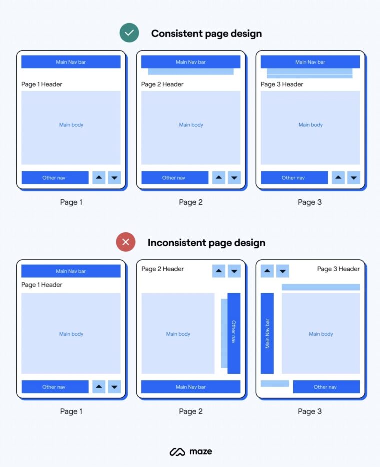
The human brain is fundamentally a pattern-recognition system, evolved to identify consistent sequences in the environment. This neurological predisposition explains why consistency in interface design reduces cognitive load—users develop mental models of how systems work, then apply those models across interactions.
Neurological research using fMRI reveals that inconsistent interfaces activate the brain’s conflict-monitoring systems (particularly the anterior cingulate cortex), creating subconscious stress and increasing perceived effort. Consistent interfaces, by contrast, allow users to operate primarily through the basal ganglia—brain structures supporting habit formation and automatic processing.
Practical implementation of consistency extends beyond visual repetition to include:
-
Conceptual consistency: Similar functions operating similarly across contexts
-
Temporal consistency: Reasonable response times with appropriate feedback
-
Platform consistency: Respecting established conventions of specific ecosystems (iOS vs. Android patterns)
The most sophisticated implementations employ design systems—comprehensive collections of reusable components guided by clear standards. Companies like IBM with its Carbon Design System, Google with Material Design, and Shopify with Polaris have documented 40-60% reductions in development time alongside significant improvements in usability metrics after implementing comprehensive design systems.
Visual Hierarchy: Directing Attention Through Perceptual Psychology

Visual hierarchy represents applied attention economics—the strategic allocation of user attention in an environment of information abundance. Eye-tracking studies reveal that users don’t read interfaces but scan them in predictable patterns, most commonly F-shaped or Z-shaped trajectories depending on content structure.
The psychological principles governing visual hierarchy include:
Preattentive Processing
Certain visual properties are processed before conscious attention focuses:
-
Color (particularly red and orange attract immediate attention)
-
Orientation (deviations from alignment patterns)
-
Size (larger elements assuming greater importance)
-
Motion (animated elements capturing attention)
Effective hierarchy leverages these preattentive attributes to guide users naturally toward important content without explicit instruction. For example, form interfaces often use color exclusively for primary actions (green for submit, red for delete) while maintaining monochromatic secondary options.
Information Scent
Derived from information foraging theory, this concept suggests users follow cues (scent) suggesting they’re moving toward valuable information. Strong visual hierarchy creates clear scent trails through:
-
Headings that accurately describe following content
-
Links whose wording matches destination pages
-
Images that conceptually relate to adjacent content
Interfaces with strong information scent demonstrate 25-40% higher task completion rates according to usability testing aggregations from the Nielsen Norman Group.

The Gestalt Principles: How Humans Naturally Organize Visual Information
Gestalt psychology—founded in the early 20th century—identifies fundamental ways humans perceive visual elements as unified wholes. These principles provide scientific foundations for numerous UI design practices:
Proximity
Elements close together are perceived as related. Interface applications include:
-
Grouping form labels near their corresponding inputs
-
Positioning action buttons adjacent to the content they affect
-
Maintaining consistent spacing within related component groups
Similarity
Elements sharing visual characteristics (color, shape, size) are perceived as related. Applications include:
-
Using consistent button styles for similar action types
-
Employing color coding to indicate categorical relationships
-
Maintaining typographic consistency for content at the same hierarchical level
Closure
The mind completes incomplete forms when enough of the pattern is present. Applications include:
-
Using partial borders to suggest containment without visual weight
-
Implementing loading animations that allow anticipation of completion
-
Creating minimalist icons that suggest complete forms through negative space
Common Fate
Elements moving together are perceived as related. Modern applications include:
-
Parallax scrolling establishing depth relationships
-
Animation grouping indicating functional relationships
-
Synchronized transitions suggesting systematic connections
These perceptual principles aren’t arbitrary design preferences but hardwired cognitive processes that, when respected, create interfaces aligning with natural human perception rather than working against it.
Advanced Principles: Bridging Aesthetics and Cognitive Science
The Golden Ratio and Visual Harmony: Mathematical Foundations
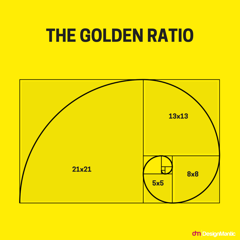
The Golden Ratio (approximately 1.618:1) represents a proportional relationship found throughout natural structures, classical art, and architectural masterpieces. While sometimes over-applied as a design panacea, its genuine value lies in creating intrinsically balanced compositions that feel naturally harmonious.
Neuroscientific research indicates that images following golden proportions trigger different brain activity than randomly composed images. Specifically, they produce:
-
Increased activation in the nucleus accumbens, associated with reward processing
-
Reduced activation in the amygdala, associated with stress and threat detection
-
Enhanced coordination between visual processing regions and emotional centers
Practical implementation extends beyond literal 1.618 ratios to include:
-
Fibonacci sequences in spacing systems (8px, 13px, 21px, 34px, etc.)
-
Golden spirals guiding visual flow through complex layouts
-
Section divisions creating balanced asymmetrical compositions
Modern design systems like those developed by Adobe and Airbnb incorporate proportional systems based on these mathematical relationships, resulting in interfaces rated as 18-27% more aesthetically pleasing in controlled user testing.
Cognitive Load Theory and Interface Complexity
Cognitive Load Theory, developed by educational psychologist John Sweller, explains how working memory limitations affect learning and performance. While originally applied to instructional design, its principles directly inform interface design:
Intrinsic Load: The inherent difficulty of the task itself
Extraneous Load: Cognitive effort unrelated to the task, often caused by poor design
Germane Load: Effort devoted to schema formation and automation
Effective interfaces minimize extraneous load while optimizing germane load through:
-
Progressive disclosure: Revealing complexity gradually as users build competence
-
Chunking information: Grouping related items into manageable units (ideally 3-5 items per group)
-
Dual coding: Presenting information both visually and verbally when appropriate
Applications incorporating these principles demonstrate 40-50% reductions in user errors during complex tasks according to human-computer interaction research from Carnegie Mellon University.
The Complete UI Design Process: From Concept to Continuous Improvement
Phase 1: Foundational Research and Strategic Discovery
Before any visual design begins, comprehensive discovery establishes the contextual foundation:
User Research Methodologies
-
Contextual inquiry: Observing users in their actual environments
-
Job story mapping: Documenting user motivations and desired outcomes
-
Cognitive walkthroughs: Simulating the user’s problem-solving process
-
Accessibility audits: Identifying potential barriers for diverse users
Competitive Interface Analysis
Systematic evaluation of existing solutions identifies patterns, conventions, and opportunities. This includes:
-
Feature inventories cataloging interface approaches across competitors
-
Heuristic evaluations assessing usability against established principles
-
Interaction pattern libraries documenting recurring solutions to common problems
Technical and Business Constraint Identification
Realistic design operates within constraints including:
-
Platform capabilities and limitations
-
Development resources and timelines
-
Business requirements and success metrics
-
Accessibility and compliance requirements
Phase 2: Structural Design and Information Architecture
With research insights synthesized, the focus shifts to structural planning:
Taxonomy Development
Creating logical categorization systems that match user mental models rather than organizational structures. Card sorting exercises with representative users typically reveal 3-5 primary organizational frameworks, with the most intuitive approach selected for further development.
Task Flow Mapping
Diagramming complete user journeys from initial entry to goal completion, identifying:
-
Critical decision points requiring clear interface guidance
-
Potential abandonment points requiring motivational design
-
Efficiency opportunities through task streamlining
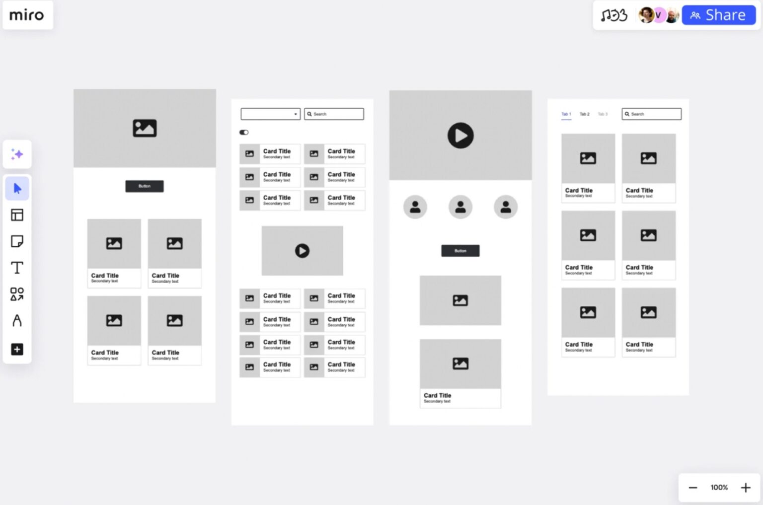
Wireframing and Low-Fidelity Prototyping
Creating structural representations without visual styling to validate:
-
Content prioritization and hierarchy
-
Navigation efficiency and findability
-
Workflow logic and task sequencing
Phase 3: Visual Design and High-Fidelity Prototyping
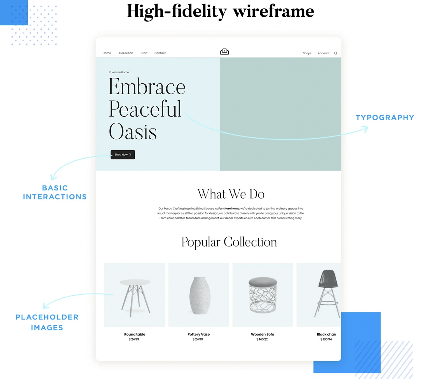
With validated structures established, visual design brings interfaces to life:
Design System Development
Rather than designing isolated screens, modern approaches build comprehensive systems including:
-
Color palettes with semantic meaning (primary, secondary, error, success, warning)
-
Typography scales establishing clear hierarchical relationships
-
Spacing systems based on mathematical progressions
-
Component libraries with multiple states and variations
-
Motion guidelines establishing personality through animation
Visual Design Application
Applying the design system to create cohesive, branded interfaces that:
-
Communicate hierarchy through intentional contrast and scale
-
Establish rhythm through consistent spacing and alignment
-
Guide interaction through strategic color and typography
-
Support accessibility through sufficient contrast and legibility
Interactive Prototyping
Creating high-fidelity simulations that allow realistic user testing of:
-
Microinteractions and transitional states
-
Gesture responses and interactive feedback
-
Animation timing and motion physics
Phase 4: Validation Through Rigorous Testing
Design assumptions require validation through multiple testing methodologies:
Usability Testing Protocols
-
Moderated task-based testing: Observing users completing specific tasks
-
First-click testing: Determining if initial navigation choices align with expectations
-
Five-second testing: Assessing immediate visual comprehension
-
Accessibility testing: Evaluating interface usability with assistive technologies
Quantitative Measurement
-
Success rate tracking: Percentage of users completing key tasks
-
Time-on-task measurement: Efficiency of task completion
-
Error rate analysis: Frequency and severity of user mistakes
-
Satisfaction metrics: Subjective user experience ratings
Iterative Refinement
Testing rarely confirms perfect initial designs but rather reveals improvement opportunities. The most effective teams establish clear iteration cycles with:
-
Priority frameworks for addressing identified issues
-
Revision protocols ensuring changes don’t introduce new problems
-
Validation requirements confirming improvements before implementation
Phase 5: Implementation and Collaboration
The transition from design to development represents a critical phase requiring structured collaboration:
Design-Development Handoff Systems
Modern tools like Figma, Sketch with Zeplin, and Adobe XD with support automated handoff processes including:
-
Asset export with multiple format options
-
Style documentation with code generation capabilities
-
Component specification with behavior documentation
-
Redline annotation for precise implementation guidance
Agile Design Integration
Successful teams integrate design within agile development through:
-
Design sprint alignment with development sprints
-
Continuous design review throughout implementation
-
Component-driven development matching design system structure
-
Regular design QA identifying implementation discrepancies
Phase 6: Launch Assessment and Continuous Optimization
Post-launch monitoring ensures interfaces perform as intended and identifies improvement opportunities:
Analytics Implementation
Tracking key behavioral indicators including:
-
Feature adoption rates for new interface elements
-
Funnel conversion metrics through key workflows
-
Engagement patterns across different interface sections
-
Error frequency and recovery rates
Continuous Feedback Collection
Establishing ongoing user insight streams through:
-
In-product feedback mechanisms (ratings, surveys, feedback buttons)
-
User session recording (with appropriate privacy considerations)
-
Support ticket analysis identifying recurring pain points
-
Community feedback monitoring across social channels
Iterative Improvement Cycles
Using collected data to drive continuous refinement through:
-
A/B and multivariate testing of interface variations
-
Quarterly usability reviews with representative users
-
Accessibility compliance monitoring and enhancement
-
Performance optimization based on usage patterns
Emerging Frontiers in UI Design
Adaptive and Predictive Interfaces
Machine learning enables interfaces that adapt to individual users based on behavior patterns, contextual factors, and demonstrated preferences. These systems move beyond responsive design (adapting to screen size) to responsive interaction (adapting to user needs).
Current implementations include:
-
Content prioritization based on usage history
-
Workflow shortcuts anticipating next likely actions
-
Complexity adjustment based on demonstrated proficiency
-
Accessibility adaptation responding to interaction patterns indicating difficulty
Ethical considerations around data usage, transparency, and user control represent significant challenges requiring careful design consideration.
Voice and Multimodal Interfaces
As natural language processing advances, voice interfaces represent an expanding frontier. However, the most promising approaches combine multiple interaction modes:
Multimodal patterns might include:
-
Voice input with visual confirmation
-
Gesture initiation with voice completion
-
Haptic feedback confirming voice commands
-
Glanceable displays providing voice interface status
These multimodal approaches address limitations of pure voice interfaces while leveraging their strengths in specific contexts.
Emotional Interface Design
Beyond functional efficiency, emerging research explores interfaces that respond to and influence emotional states. Applications include:
-
Stress detection through interaction patterns (typing speed, pressure, hesitation)
-
Interface modulation to reduce frustration during difficult tasks
-
Positive reinforcement through celebratory microinteractions
-
Empathetic responses to user struggles or errors
While this represents a nascent field, early research suggests emotionally intelligent interfaces may improve both satisfaction and performance in challenging tasks.
The Strategic Imperative of Intentional Interface Design
User interface design has evolved from a technical implementation detail to a strategic business competency with measurable impact across acquisition, conversion, retention, and brand perception. The most successful digital products recognize that interfaces serve as the primary conversation between organizations and users—a conversation that either builds trust and capability or creates frustration and abandonment.
The science of UI design continues advancing, integrating insights from cognitive psychology, behavioral economics, human-computer interaction research, and neuroscience. However, these scientific foundations don’t replace creativity but rather channel it toward solutions that align with how humans naturally perceive, process, and interact with information.
Forward-looking organizations recognize that interface excellence requires ongoing investment in design systems, user research, and iterative testing. This investment pays compounding returns through improved user satisfaction, increased conversion rates, reduced support costs, and stronger competitive differentiation.
As digital interactions continue displacing and augmenting physical experiences, the quality of our interfaces increasingly determines the quality of our connections—to information, to services, and to each other. In this context, thoughtful UI design transcends technical optimization to become a fundamental contributor to human capability and digital civilization.
Read More: Why Loyalty Program Members Are Your Best Defense Against Negative Reviews


