
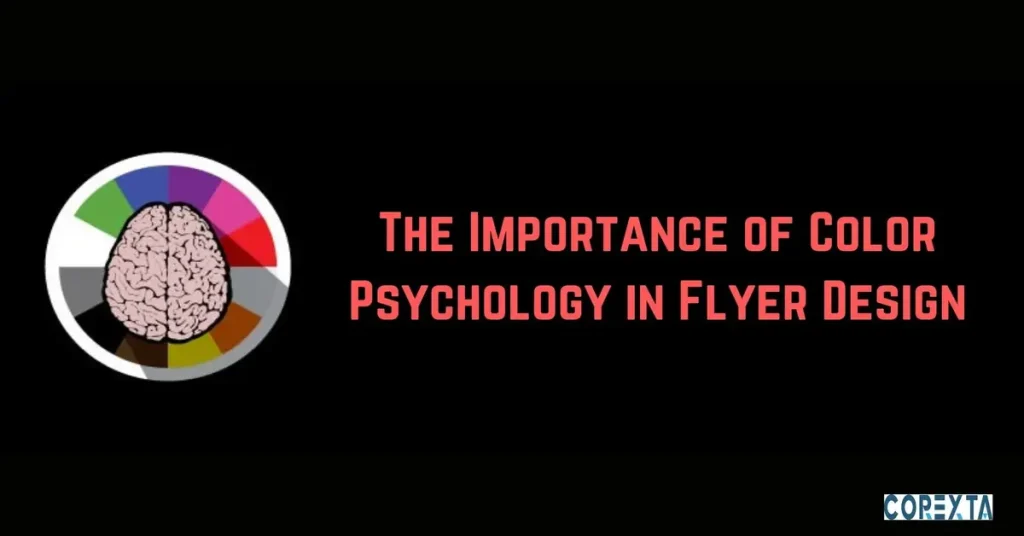
Color psychology plays a pivotal role in the effectiveness of flyer design. Understanding how colors influence human emotions and perceptions can significantly enhance the impact of your flyers. In the bustling marketing world, where capturing attention is paramount, harnessing the power of color psychology can make your flyers stand out amidst the noise.
Color psychology delves into people’s subconscious associations with different colors. It’s not merely about aesthetics; it’s about tapping into the deep-seated emotions and responses that colors evoke. By leveraging these psychological nuances, you can create flyers that resonate with your audience on a deeper level, eliciting the desired response and driving action.
This article will explore the fundamentals of color psychology, how it operates, the various meanings associated with different colors, practical tips for integrating color psychology into flyer design, and real-life examples showcasing its efficacy. Additionally, we’ll highlight the value of professional flyer design services, such as those offered by Pro Real Tech, in leveraging color psychology to create compelling and impactful flyers.
Understanding the importance of color psychology in flyer design is not just about adding visual appeal; it’s about crafting a message that speaks directly to the hearts and minds of your audience, compelling them to engage with your brand or message. Explore this fascinating design aspect and how it can elevate your flyer marketing efforts.
What is Color Psychology?
Color psychology studies how colors affect human behavior, emotions, and perceptions. It delves into people’s subconscious associations with different colors and examines how these associations influence their thoughts and actions.
Colors have the power to evoke specific emotions and responses in individuals, often on a subconscious level. For example, warm colors like red and orange can create excitement, passion, or urgency, while cool colors like blue and green may evoke a sense of calmness, trust, or tranquility.
Understanding color psychology is crucial in various fields, including marketing and design, where visual communication is paramount. In flyer design, selecting the right colors can significantly affect how your target audience receives your message.
By harnessing the principles of color psychology, designers can strategically choose colors that align with the flyer’s intended message or objective. Whether promoting a sale, announcing an event, or conveying brand identity, the use of appropriate colors can enhance the flyer’s effectiveness and increase its impact on the viewer.
How Does Color Psychology Work?
Color psychology operates on the principle that colors can evoke specific emotions, associations, and responses in individuals. This phenomenon occurs consciously and subconsciously, influencing how people perceive and interpret visual stimuli.
One fundamental mechanism through which color psychology works is the cultural and societal associations attached to different colors. For example, in Western cultures, the color red is often associated with passion, love, and excitement, while in Eastern cultures, it may symbolize luck, prosperity, or celebration. These cultural associations shape our perceptions of colors and influence how we respond to them.
Another aspect of color psychology is the physiological response that colors can trigger in the human body. Research has shown that specific colors can affect heart rate, blood pressure, and appetite. For instance, studies have found that exposure to blue can have a calming effect and lower stress levels, while red may increase heart rate and stimulate appetite.
Color psychology considers individuals’ psychological and emotional associations with different colors based on personal experiences, memories, and preferences. For example, someone who had a positive childhood experience associated with the color yellow may feel happy and uplifted when they see it. In contrast, another person who had a negative experience may associate it with caution or anxiety.
Understanding how color psychology works is essential for creating visually compelling and impactful designs in flyer design. By strategically selecting colors that align with the intended message and audience preferences, designers can evoke viewers’ desired emotions and responses.
The Different Meanings of Colors
Colors carry various meanings and associations that can evoke specific emotions, perceptions, and responses in individuals. Understanding the meanings behind different colors is essential for effective flyer design, as it allows designers to communicate messages more clearly and resonate with the target audience.
Red
Red symbolizes passion, energy, and excitement with its bold and vibrant demeanor. It possesses the innate ability to ignite urgency and importance within viewers, making it an ideal choice for promotions, sales, or limited-time offers. When used strategically, red commands attention and compels action, harnessing its dynamic essence to captivate audiences in the bustling marketing landscape.
Blue
Blue, reminiscent of vast skies and serene waters, exudes calmness, trust, and reliability. Its tranquil aura instils professionalism and credibility, making it a staple in corporate branding and marketing materials. Blue communicates stability and integrity, fostering trust and confidence in the audience and thus establishing a solid foundation for lasting connections.
Green
Green, synonymous with nature’s bounty and vitality, evokes growth, harmony, and renewal. It embodies the essence of freshness and abundance, making it a powerful symbol for eco-friendly products or health-oriented campaigns. Green signifies prosperity and balance, resonating with audiences seeking sustainable solutions and wholesome experiences.
Yellow
Yellow, with its radiant glow and sunny disposition, embodies brightness, optimism, and warmth. It infuses messages with joy, positivity, and energy, making it an effective tool for uplifting spirits and fostering engagement. However, yellow’s exuberance should be wielded judiciously, as excessive use may overwhelm viewers, diluting the intended impact.
Orange
Orange, a vibrant fusion of red’s dynamism and yellow’s warmth, exudes enthusiasm, creativity, and excitement. Its spirited nature injects fun and vibrancy into marketing materials, particularly those targeting youthful or innovative audiences. Orange ignites curiosity and sparks interest, propelling viewers into action with its contagious energy.
Purple
Purple symbolizes royalty, luxury, and sophistication with its regal allure and enigmatic charm. It exudes an air of mystery and refinement, making it ideal for high-end products or services aimed at discerning clientele. Purple captivates with its elegance and allure, leaving a lasting impression of luxury and exclusivity.
Black
Black, the epitome of power, elegance, and timelessness, commands attention with its authoritative presence. It exudes sophistication and allure, evoking a sense of luxury and prestige. Black’s versatility allows it to enhance other colors, creating a sleek and modern aesthetic or accentuating contrasting elements for heightened visual impact.
White
White, with its pristine purity and luminous clarity, embodies simplicity, cleanliness, and innocence. It offers a minimalist backdrop that enhances the visibility of other design elements, fostering clarity and focus. White’s airy expanse creates a sense of spaciousness and openness, inviting viewers to immerse themselves in the message with unencumbered clarity.
How to Use Color Psychology in Flyer Design
Utilizing color psychology effectively in flyer design involves several key considerations to maximize the impact of your message. Here are some practical tips for integrating color psychology into your flyer designs:
1. Understand Your Audience
Begin by understanding your target audience and their preferences. Consider age, gender, cultural background, and psychographic traits. Tailor your color choices to resonate with your audience’s tastes and values, ensuring your flyer captures their attention and elicits the desired response.
2. Choose Colors Wisely
Select colors based on their psychological associations and intended message. Consider the emotions and perceptions you want to evoke in viewers and choose colors accordingly. For example, if you’re promoting a sale, vibrant reds or yellows can convey a sense of urgency and excitement, while calming blues or greens may be more suitable for promoting wellness services.
3. Create Contrast
Use contrasting colors to draw attention to critical elements of your flyer, such as headlines, call-to-action buttons, or essential information. Contrast helps these elements stand out against the background and guides the viewer’s eye to the most critical parts of the flyer. Experiment with complementary or contrasting color combinations to achieve maximum visual impact.
4. Maintain Consistency
Maintain consistency in your color scheme throughout the flyer to create a cohesive and visually appealing design. Choose a primary color palette and stick to it across all flyer elements, including text, graphics, and backgrounds. Consistency helps reinforce brand identity and ensures your flyer delivers a unified message to the audience.
5. Consider Cultural Differences
Be mindful of cultural differences and the varying associations of different colors in other cultures. What may be perceived positively in one culture could have negative connotations in another—research cultural norms and preferences to avoid unintentionally offending or alienating your audience with inappropriate color choices.
6. Test and Iterate
Finally, test different color combinations and designs to gauge their effectiveness before finalizing your flyer. Conduct A/B testing with varying flyer versions to see which performs better regarding engagement and conversion rates. Use feedback from testing to iterate and refine your designs, ensuring they resonate with your audience and achieve your marketing objectives.
Examples of Effective Flyer Designs Using Color Psychology
Let’s explore some real-life examples of flyer designs that effectively leverage color psychology to captivate audiences and drive engagement:
1. Apple Product Launch Flyers
Apple is known for its sleek and minimalist design aesthetic, often incorporating clean whites and subtle grays into its flyer designs. These colors convey a sense of sophistication, elegance, and innovation, reflecting Apple’s brand identity as a premium technology company. By using minimalist color schemes, Apple’s flyers highlight the quality and simplicity of their products, enticing consumers with a sense of luxury and exclusivity.
2. Lululemon Athletica Fitness Event Flyers
Lululemon Athletica, a famous activewear brand, frequently hosts fitness events and workshops advertised through vibrant and energetic flyer designs. These flyers often feature bold combinations of blues, greens, and yellows, evoking feelings of vitality, motivation, and empowerment. By incorporating these lively colors, Lululemon effectively communicates the energy and excitement of their events, encouraging participation and fostering a sense of community among fitness enthusiasts.
3. Airbnb Travel Experience Flyers
Airbnb utilizes a diverse range of colors in its flyer designs to reflect its platform’s unique experiences and destinations. From tranquil blues for beach getaways to earthy greens for nature retreats, Airbnb’s flyers employ color psychology to evoke the emotions and sensations associated with different travel experiences. By immersing viewers in vivid and evocative imagery, Airbnb inspires wanderlust and encourages travelers to explore new destinations.
4. Nike Fitness Challenge Flyers
Nike often promotes fitness challenges and events through dynamic and energetic flyer designs. These flyers typically feature bold reds, oranges, and blacks, symbolizing determination, strength, and intensity. Using these powerful colors, Nike motivates athletes and fitness enthusiasts to push their limits and achieve their goals. The vibrant and impactful designs serve as a call to action, inspiring individuals to embrace an active lifestyle and join the movement towards health and wellness.
5. Local Farmers Market Flyers
Local farmer’s markets frequently use earthy greens, browns, and yellows in their flyer designs to evoke a sense of freshness, abundance, and community. These colors reflect the natural beauty of farm-fresh produce and the wholesome atmosphere of the market. By incorporating these organic hues, farmers’ markets appeal to health-conscious consumers seeking locally sourced, sustainable products. The inviting and rustic designs encourage patrons to support local farmers and enjoy the season’s bounty.
These examples illustrate how color psychology can be effectively utilized in flyer design to convey specific messages, evoke desired emotions, and inspire action. Whether promoting a product, event, or experience, understanding the psychological impact of colors allows designers to create compelling and impactful flyers that resonate with their target audience.
Professional Flyer Design Services from Pro Real Tech
Pro Real Tech offers professional flyer design services tailored to elevate your brand and captivate your audience. Our expert designers bring creativity and innovation to every project, ensuring your flyers stand out amidst the competition. Whether you’re promoting a product, event, or service, we craft visually stunning flyers that effectively communicate your message and drive engagement.
You can expect personalized attention to detail, quick turnaround times, and impeccable quality with us. From concept to final delivery, our team works closely with you to understand your objectives and deliver designs that exceed your expectations.
Partner with us for all your flyer design needs and take your marketing efforts to new heights.


