
Color is a source of information and is present everywhere. Individuals form their opinions within 90 seconds of their first encounters with things or people. Colors alone account for between 62‐90 % of the assessment. So, effective color selection can influence attitudes toward particular products by affecting moods and feelings, both favorably and unfavorably, in addition to helping products stand out from the competition. That’s why today, we, the Pro Real Tech agency, want to talk about eCommerce website colors.
In this post, we’ll dive into picking the right color scheme, especially for eCommerce. Because in those 90 seconds a customer checks your site, they’re forming an opinion—let’s make it count!
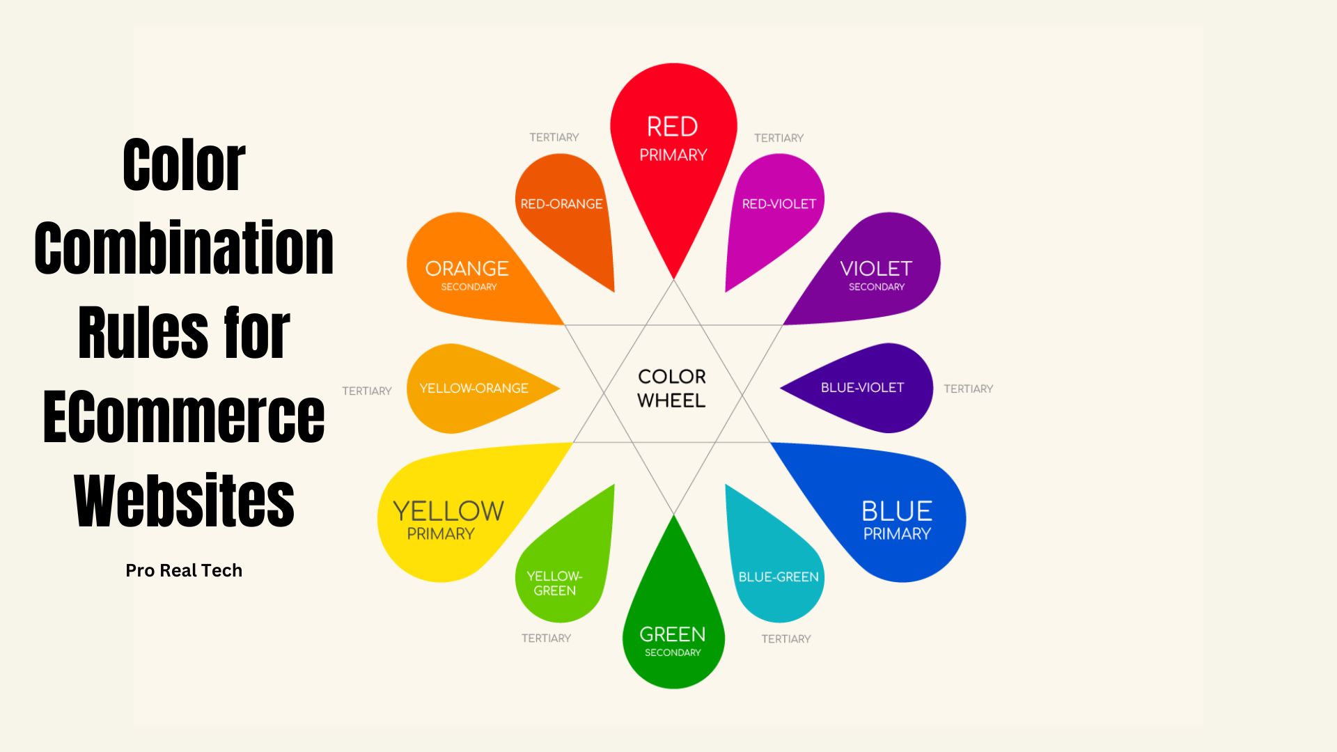
Fundamentals of Color (Learn color components)
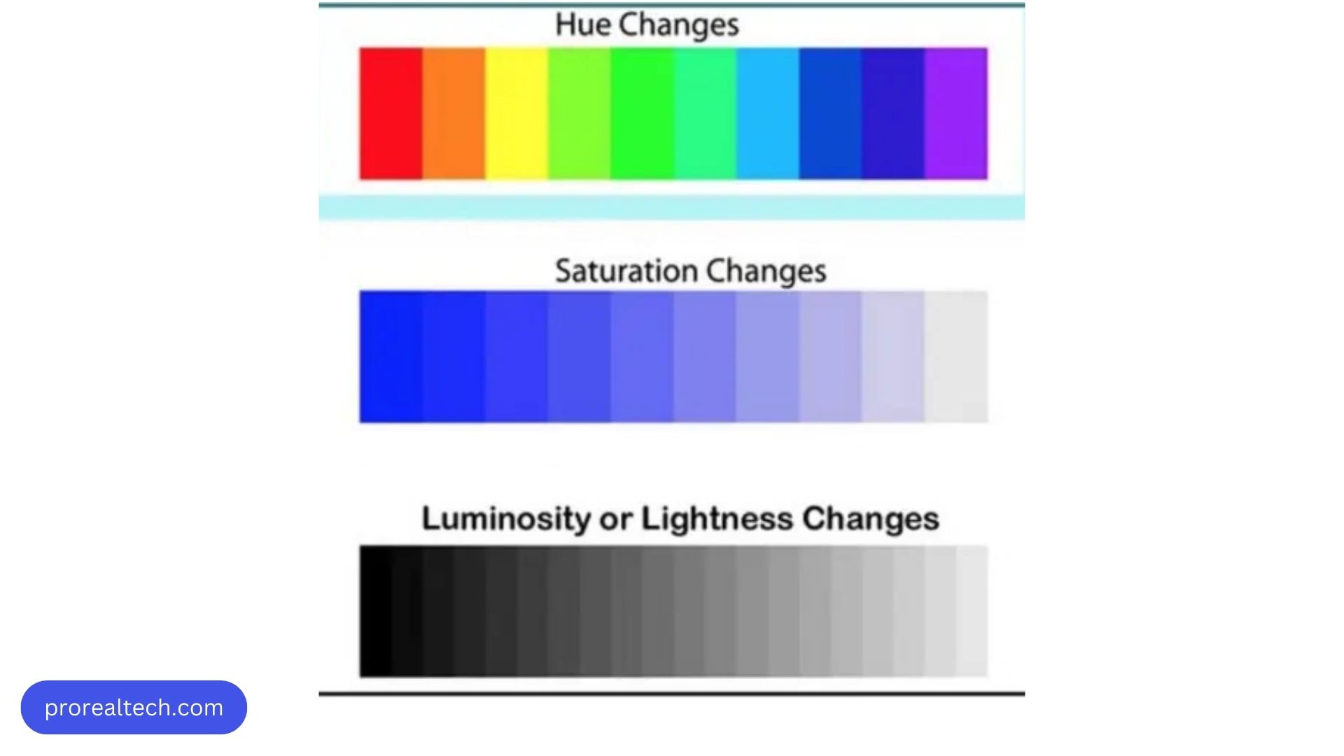
Did you know you’re not just seeing colors, but hues? Yup, there’s a difference. Keep this in mind because it’ll come in handy later when we talk about creating your brand colors using designers’ tools.
Hue means the color spectrum—like red, orange, blue—while color (web color) is a mix of hue, saturation, and luminosity. Saturation tells you how “colorful” a color is. Think “rich” or “pure.” When a color gets closer to gray, it’s less saturated. Luminosity measures how bright or dark a hue is. Each property has a value (depending on the color space, but we won’t dive into that today). For example, pastel mint has values like 147, 19, 100.
Choosing a Color Scheme for Your eCommerce Website
What’s the Ideal Color Scheme for a Website?
It varies based on the website’s purpose, who it’s for, and its overall style. Light and soft colors feel calming, while darker and bold ones bring energy. Also, think about how colors mix and how they show up on different screens. The best schemes blend well for a smooth user experience.
The 7 Major Color Schemes:
- Monochromatic: Think of different shades of a single color, like the various hues of blue in a serene ocean.
- Analogous: Colors that sit beside each other on the color wheel, like the soft blend of yellow and orange during a sunset.
- Complementary: Pairs of colors opposite each other on the color wheel, creating a striking contrast, much like yin and yang.
- Split Complementary: A variation of complementary colors, adding more depth and balance, akin to harmonizing melodies in music.
- Triadic: Three colors evenly spaced on the color wheel, creating a vibrant and dynamic palette, reminiscent of a playful rainbow.
- Tetradic: Four colors in two complementary pairs, offering versatility and creativity, akin to a versatile artist’s palette.
- Square: Four colors evenly spaced on the color wheel, providing balance and harmony, like a perfectly arranged bouquet of flowers.
Let’s Get to the Point
Start with three key elements: base, accent, and text.
- Base color: It’s your foundation. Build from here with other colors, mixing and matching shades.
- Accent color: This one stands out, used for emphasis and contrast.
- Text color: Stick to black, white, or grey. Adjust for good contrast and readability based on the background. Aim for a ratio of about 60 to 80%.
Remember, less color means more attention. Keep that in mind for your call-to-action buttons.
And avoid using complementary colors for text and background. It’s key for readability and visual appeal. (Complementary colors are those directly opposite in the color wheel.)
Using Color Harmony in Your eCommerce Website
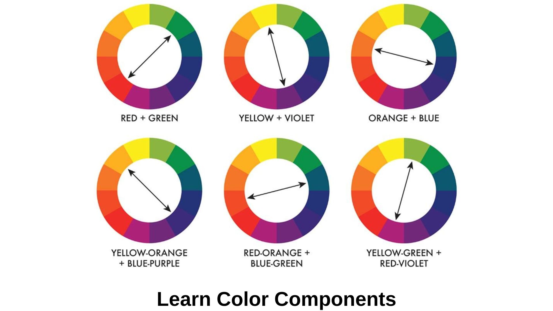
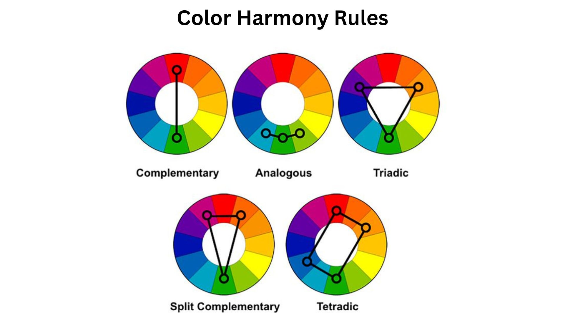
Color harmony means colors that look good together. Artists and designers use these to set a specific vibe. You can find them using a color wheel and following these 5 rules:
- Complementary: Two colors opposite each other on the wheel.
- Split-complementary: One base color and two next to its opposite.
- Analogous: Three colors next to each other on the wheel.
- Triadic: Three evenly spaced colors on the wheel.
- Tetradic: Four evenly spaced colors on the wheel.
So, for your online store, here are five key color combo rules to remember.
Color Combos for eCommerce Websites
Target, known for furniture and décor, rocks the complementary scheme. They use red and cyan, opposite on the wheel, for a vibrant look.
Now, check out London Philips, a men’s clothing brand. They stick to one color for a strong vibe.
And Gymboree, a kids’ clothing brand? They bring the hype with a tetradic scheme, using four colors to make things pop!
Creating Color Palettes Using Free Online Tools
First up, we have Adobe Color CC. Apply what you’ve learned about color components—Hue, Saturation, and Luminosity—to craft your own color. Then, jazz it up with other colors using one of the color combo rules. Voila! Your first color theme is ready!
Next, there’s Color Explorer and Canva. These tools help you pluck individual colors or whole palettes from any image, like webpage screenshots.
Then, there’s the Color Calculator. It’s an interactive color wheel that shows you which colors go together and why.
Lastly, you can check out Color Hunt for palettes created by others.
So, hop on and explore the endless possibilities of crafting your perfect color scheme for your eCommerce website!
The Psychology of Colors in eCommerce
Have you ever noticed how the colors on a website can make you feel a certain way? Colors have a big impact on our emotions, and in eCommerce, they can even affect whether we buy something. Our shopping decisions are significantly influenced by color psychology. Your business identity, logo, and goals should all be reflected in the colors you choose for your website. There is no question that people are visual creatures. Visual information is processed 60,000 times faster than any other information, accounting for 90% of all information conveyed to the brain.
Here are some color palettes to consider:
- Yellow: Bright and cheery.
- Orange: Warm and energetic.
- Red: Bold and attention-grabbing.
- Pink: Soft and romantic.
- Violet: Creative and mysterious.
- Blue: Trustworthy and calm.
- Green: Fresh and natural.
- Black: Sleek and sophisticated.
- Brown: Earthy and stable.
- White: Clean and pure.
Who’s Visiting Your eCommerce Website
This is super important. If your audience is wide-ranging, choosing colors can be tough. That’s why it’s key to focus on a specific group of people. When you narrow down your niche, things like gender, culture, and age start to matter more in color choices. Think about who you’re serving.
Consider:
- Gender: Men and women often have different color preferences. For example, men might lean towards bold and primary colors, while women might prefer softer tones or pastels. However, these are just generalizations, and it’s essential to know your specific audience’s preferences.
- Age: Different age groups have varied responses to colors. For instance, younger audiences might be more drawn to vibrant and trendy colors, while older demographics might prefer more classic and subdued tones. Understanding the age range of your target audience can help tailor your color scheme to resonate with them effectively.
Ecommerce Website’s Industry
Different industries have different preferences when it comes to colors. While color psychology isn’t an exact science, it can give you a general direction to follow on your site.
Here’s a closer look:
- Luxury Goods: If you’re selling high-end products, like designer clothes or luxury watches, aim for colors that exude sophistication and elegance. Think deep purples, rich golds, or luxurious blacks. These colors can convey a sense of exclusivity and opulence, appealing to your target audience’s desire for luxury and status.
- Eco-Products: For eco-friendly products such as organic food, sustainable clothing, or natural skincare, consider using earthy tones and nature-inspired colors. Shades of green, brown, and muted earth tones evoke feelings of harmony with nature and sustainability. These colors resonate with environmentally-conscious consumers who prioritize eco-friendly products and lifestyles.
- Home Products: When selling items for the home, like furniture, decor, or bedding, opt for warm and inviting colors that create a sense of comfort and coziness. Soft neutrals like beige, warm grays, or soft blues can evoke feelings of relaxation and serenity, making your products more appealing to potential customers looking to create a welcoming home environment.
- Food: If your eCommerce store specializes in food products, such as gourmet treats, spices, or cooking supplies, consider using colors that stimulate appetite and convey freshness. Vibrant reds, appetizing yellows, and fresh greens can make food products look more enticing and mouth-watering. These colors can also evoke feelings of energy and vitality, encouraging customers to explore your food offerings.
- Children’s Products: When targeting children and parents, vibrant and playful colors are key. Bright primary colors like red, blue, and yellow appeal to children’s sense of fun and adventure, while also capturing the attention of parents browsing for products for their kids. Incorporating playful patterns and cheerful designs can further enhance the appeal of your children’s products.
It’s important to consider the demographics of your target audience, including factors like age and gender, when choosing colors for your eCommerce website. Tailoring your color palette to match the preferences and interests of your target demographic can help attract and engage potential customers more effectively.
Final Thought
Choosing the right color palette for your eCommerce website is a multifaceted process that requires careful consideration of various factors such as industry, target audience, and psychological impact. By understanding the principles of color theory, leveraging color psychology, and aligning your color choices with your brand identity and products, you can create a visually appealing and cohesive website that resonates with your customers and enhances their overall shopping experience. Remember, colors have the power to evoke emotions, convey messages, and shape perceptions, so choose wisely to make a lasting impression on your audience and drive success for your online business.


